Jack Broeders
Normality murals
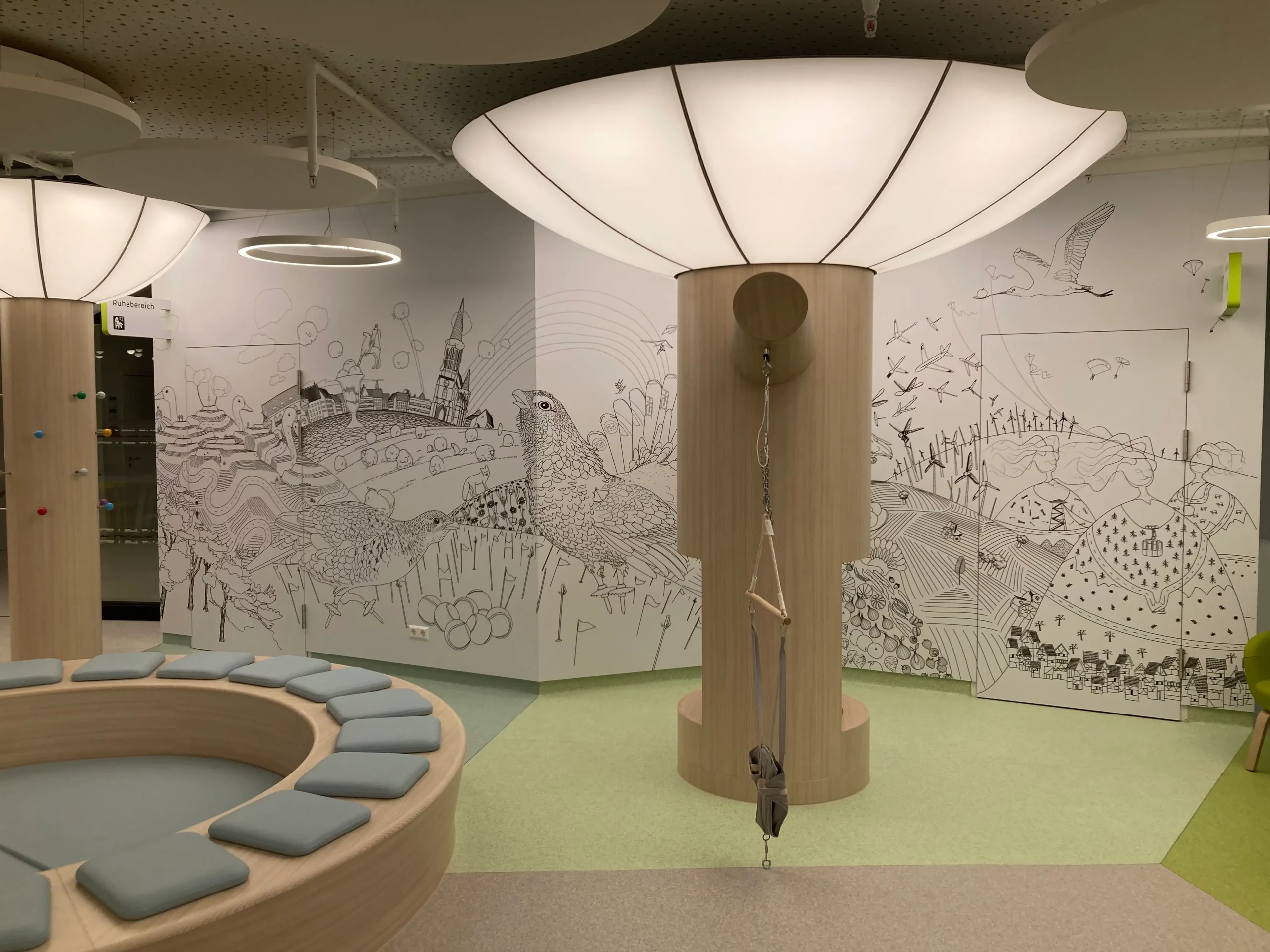
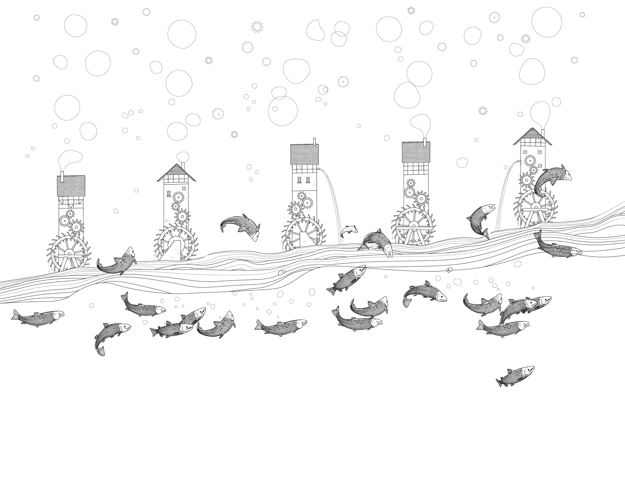
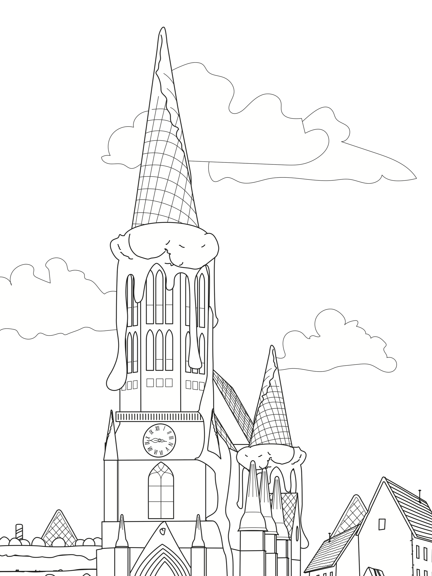
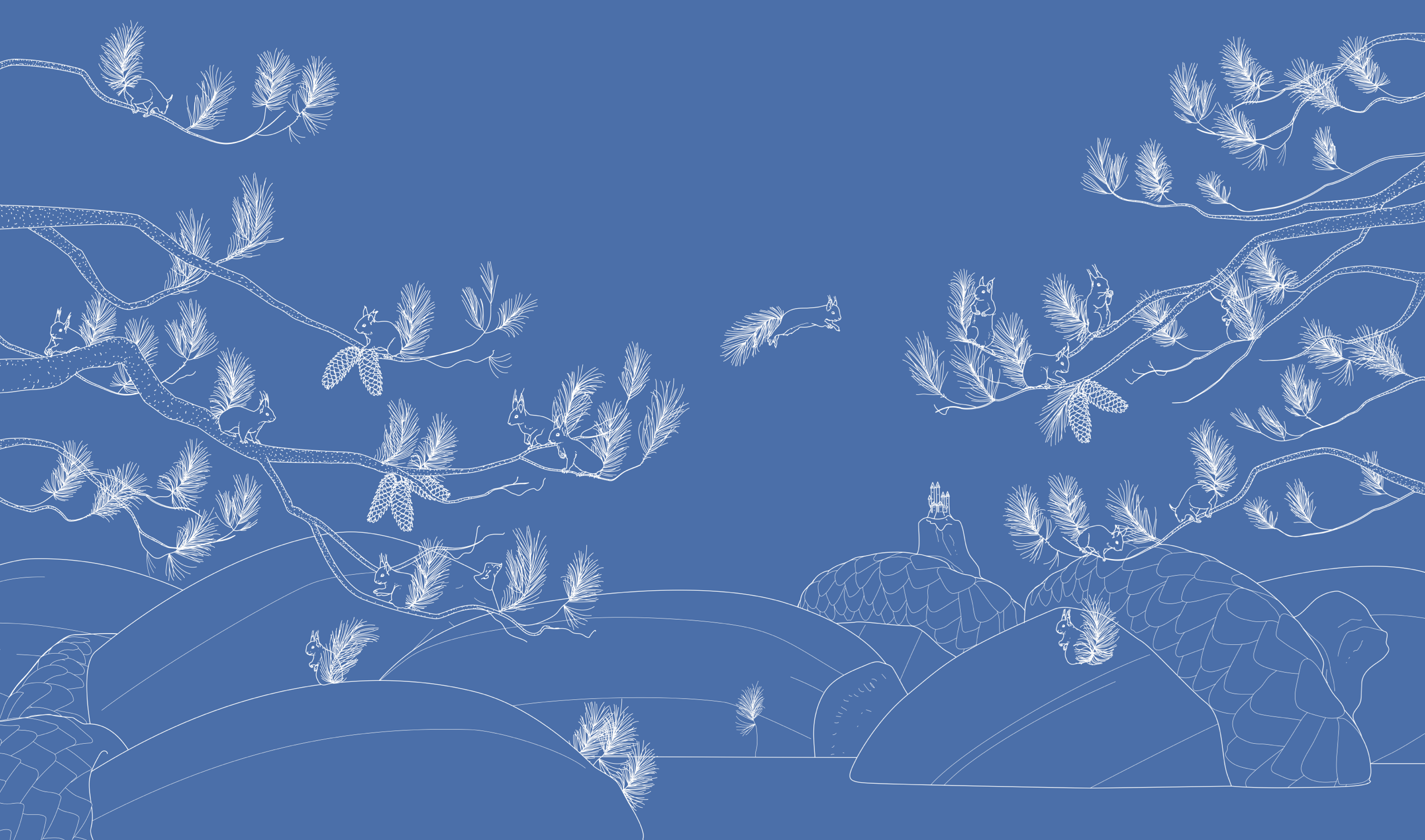
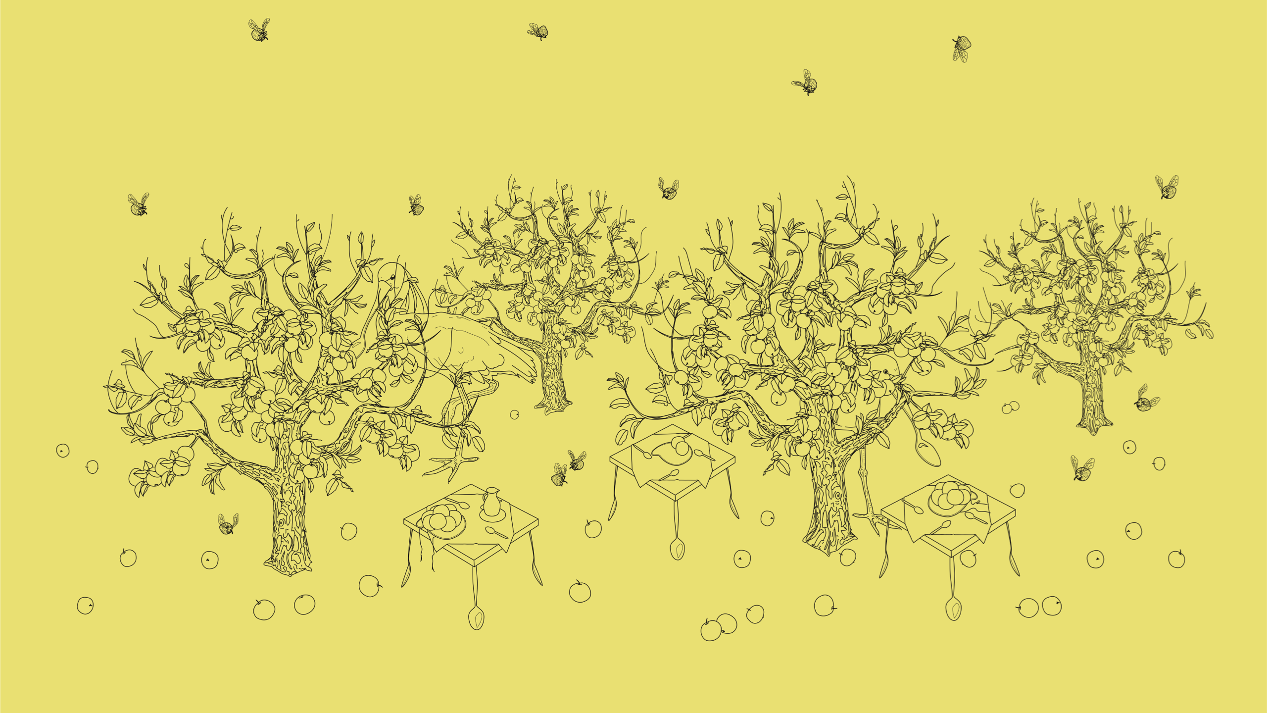
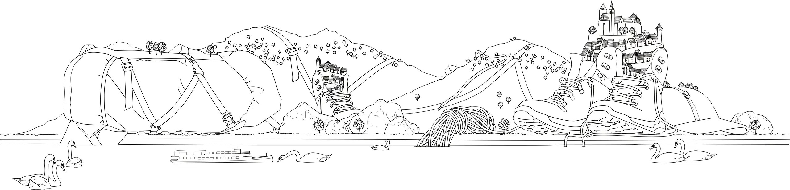
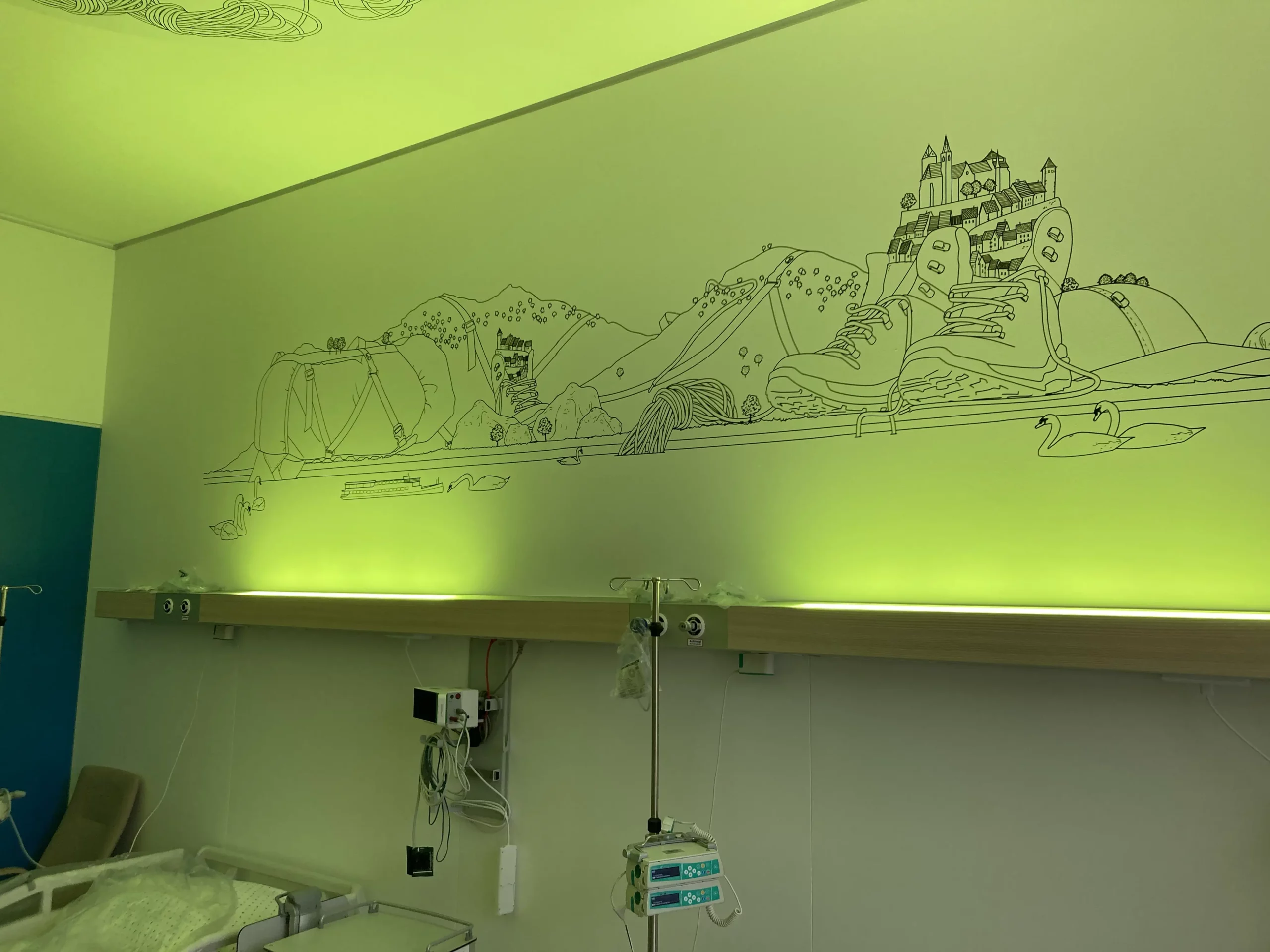
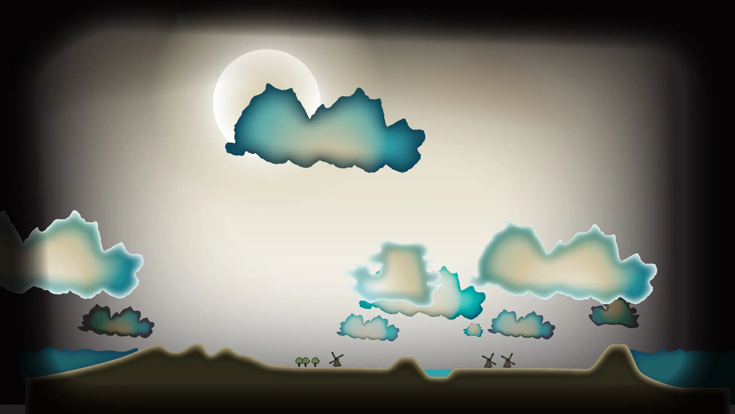
The Kinder- und Jugendklinik Freiburg is a new pediatric hospital that opened its doors at the end of 2024. The architects aimed to give the design a supportive function, contributing to the healing process and the overall well-being of patients and staff. They followed the design process guided by the idea of normality: the notion that the familiar, the ordinary, can bring calm and thereby aid recovery.
In line with this architectural psychology approach, I was asked to continue thinking and propose solutions for the further graphic decoration of the interior. The result was an interactive wall in the entrance hall and a series of wall illustrations for waiting areas, patient and treatment rooms.
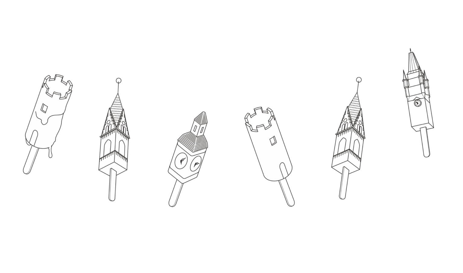
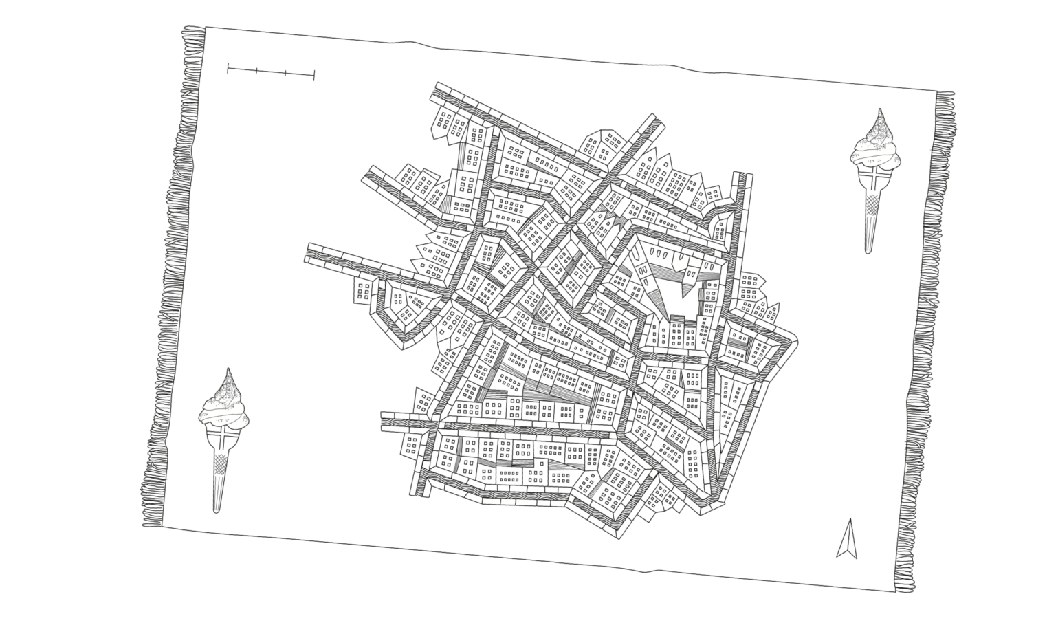
In an absurdly humorous way, elements from the immediate surroundings (the city of Freiburg, the Black Forest, and the Rhine region) were merged into surreal compositions. They evoke a sense of recognition for what is familiar, yet at the same time wonder and delight through the impossible, unexpected combinations.
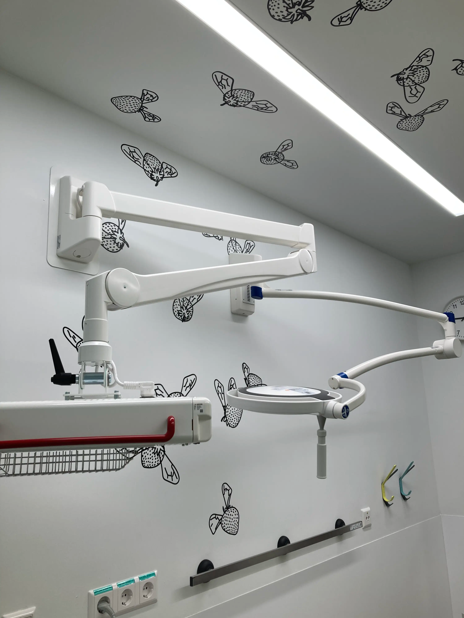
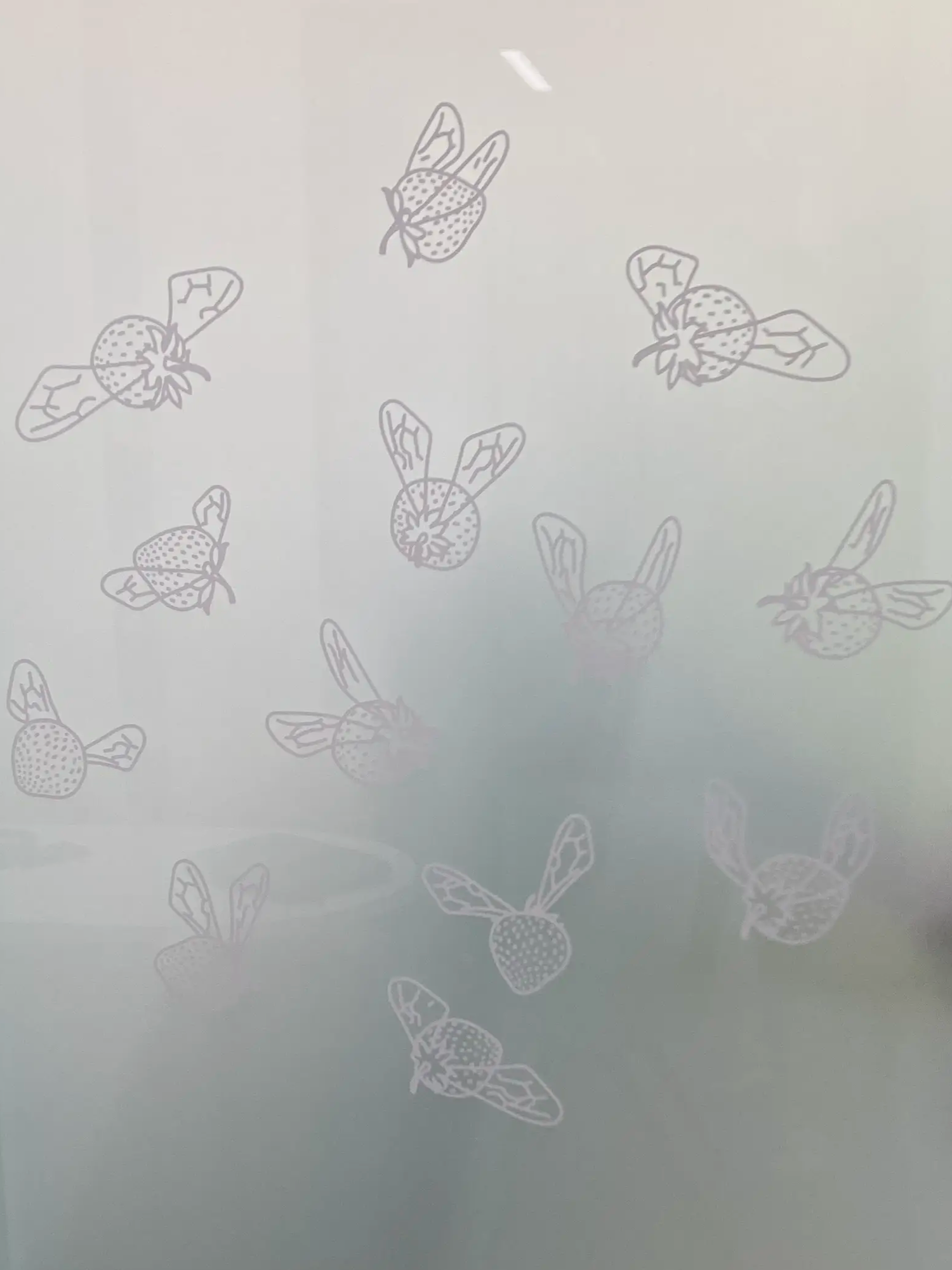
Humbleberries spread across the ceiling and walls, designed to gently distract patients during treatment. The illustrations are applied with special foils, ensuring long-term durability against both eager little hands and regular hospital cleaning routines.
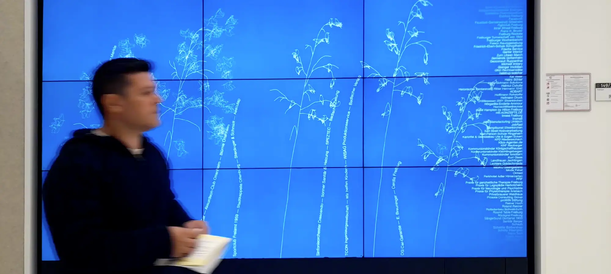
Out plumes with birds formed like their seeds, bend in the wind. Passersby make the birds startle through motion-sensor detection above the screen. This 4 by 2.6 meters interactive wall is located in the hospital’s entrance hall and also serves as a display for all parties that contributed to the creation of the new children’s hospital.
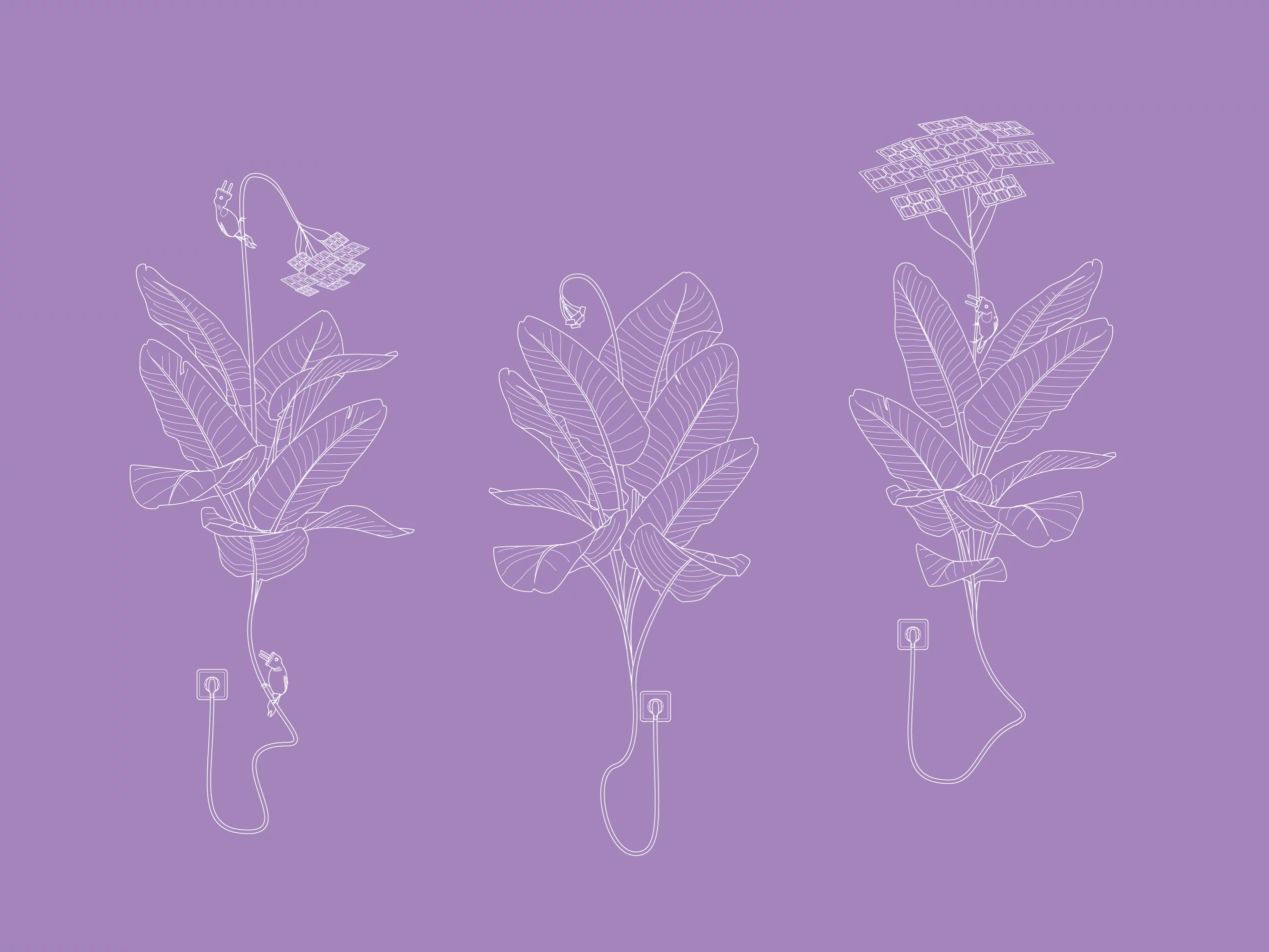
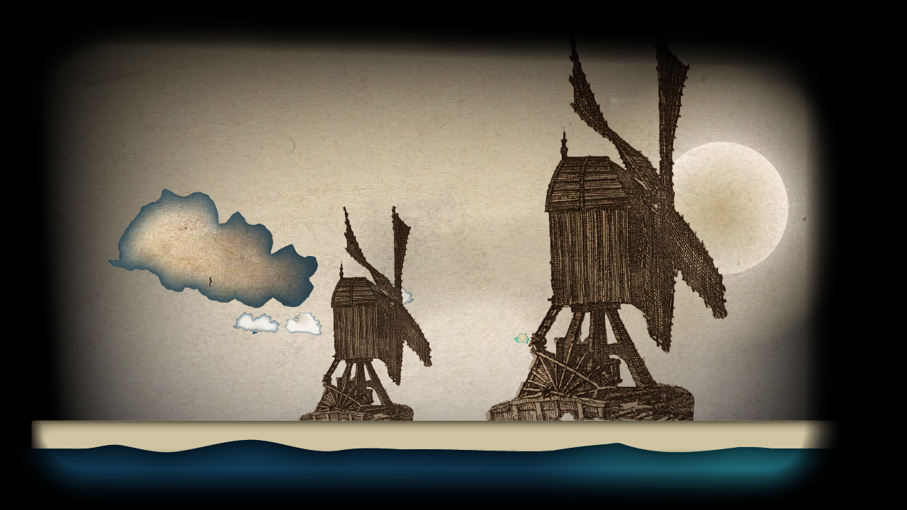
Freiburg was one of the first cities in the world to have a fully electrified, energy-neutral district. I imagined plants growing out of power sockets, sprouting solar-panel buds that, in turn, feed energy back into the outlet. The circle is complete. Here, plug parrots make themselves at home.

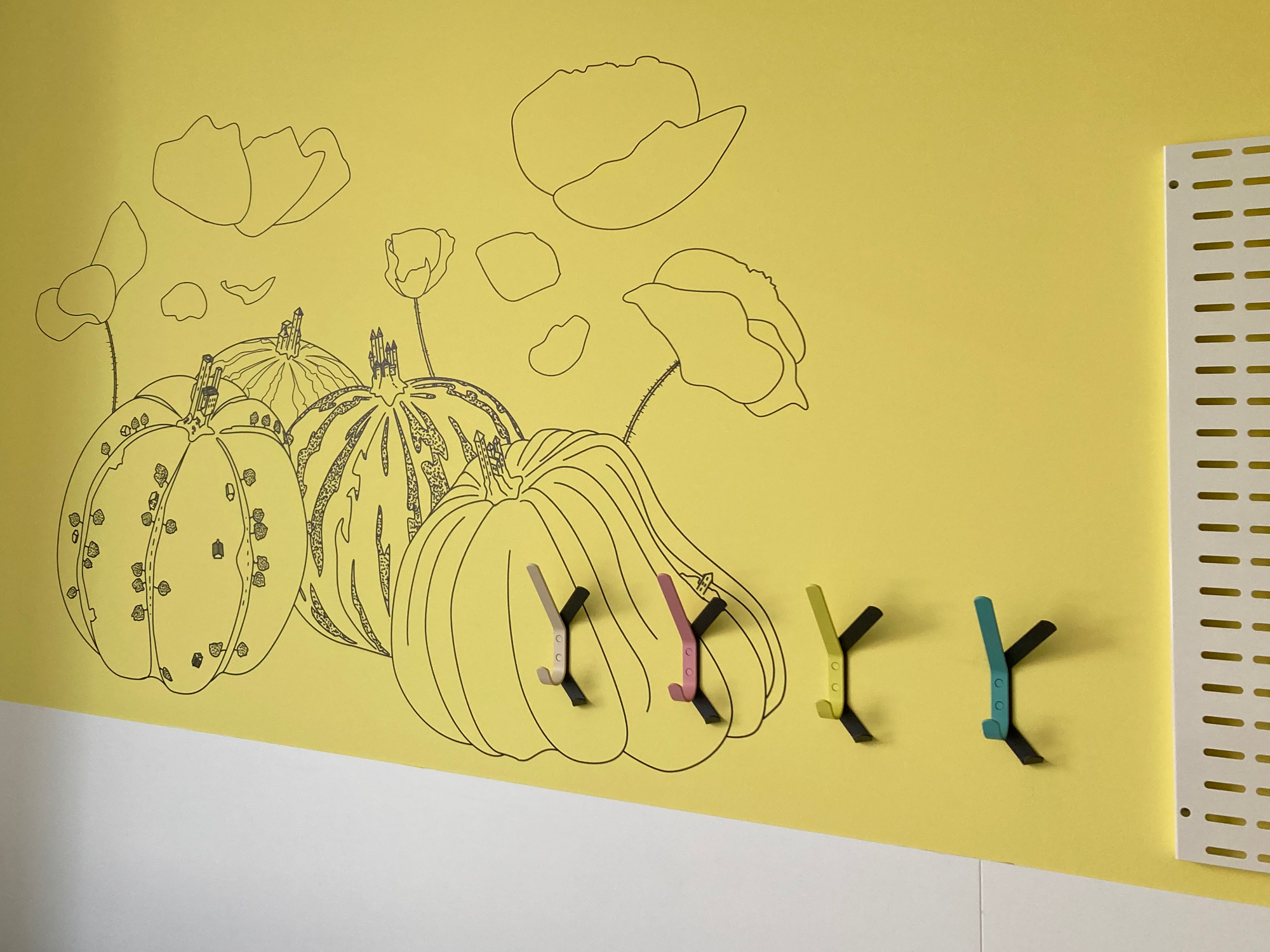
A few of the wall papers for in the patient rooms
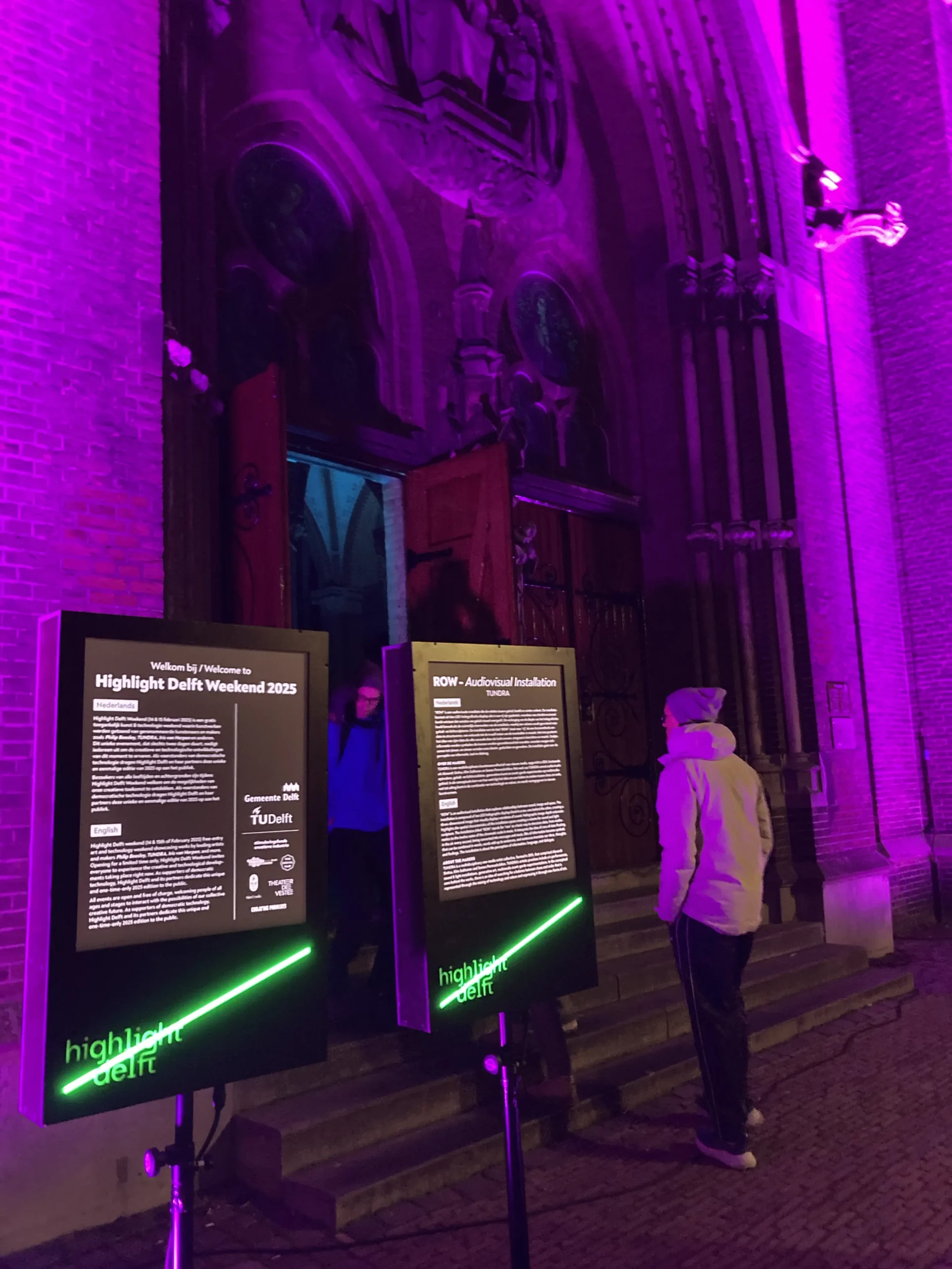
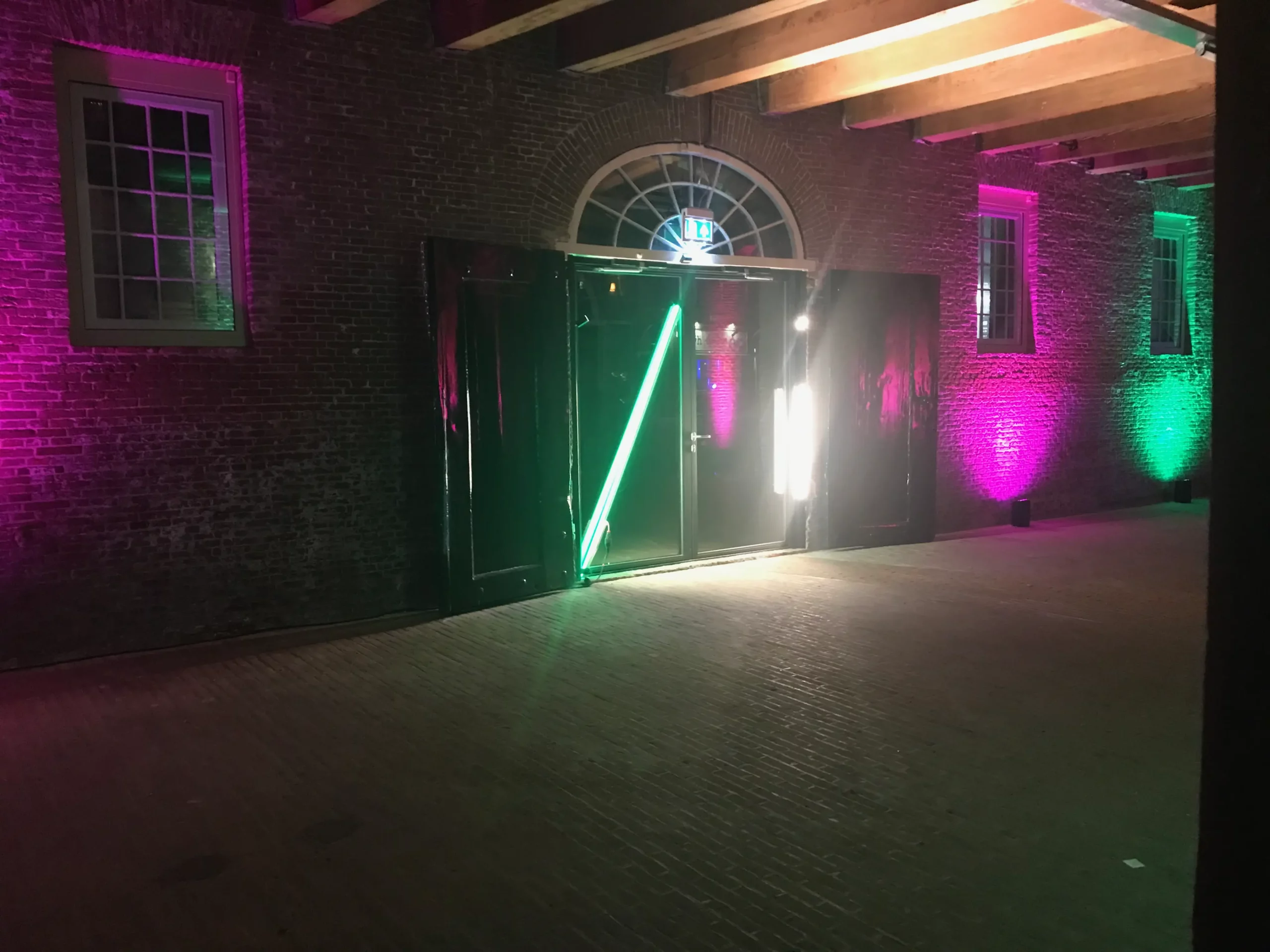
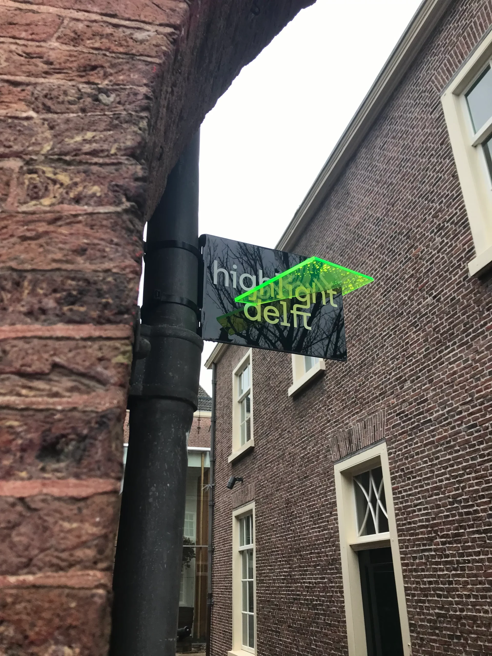
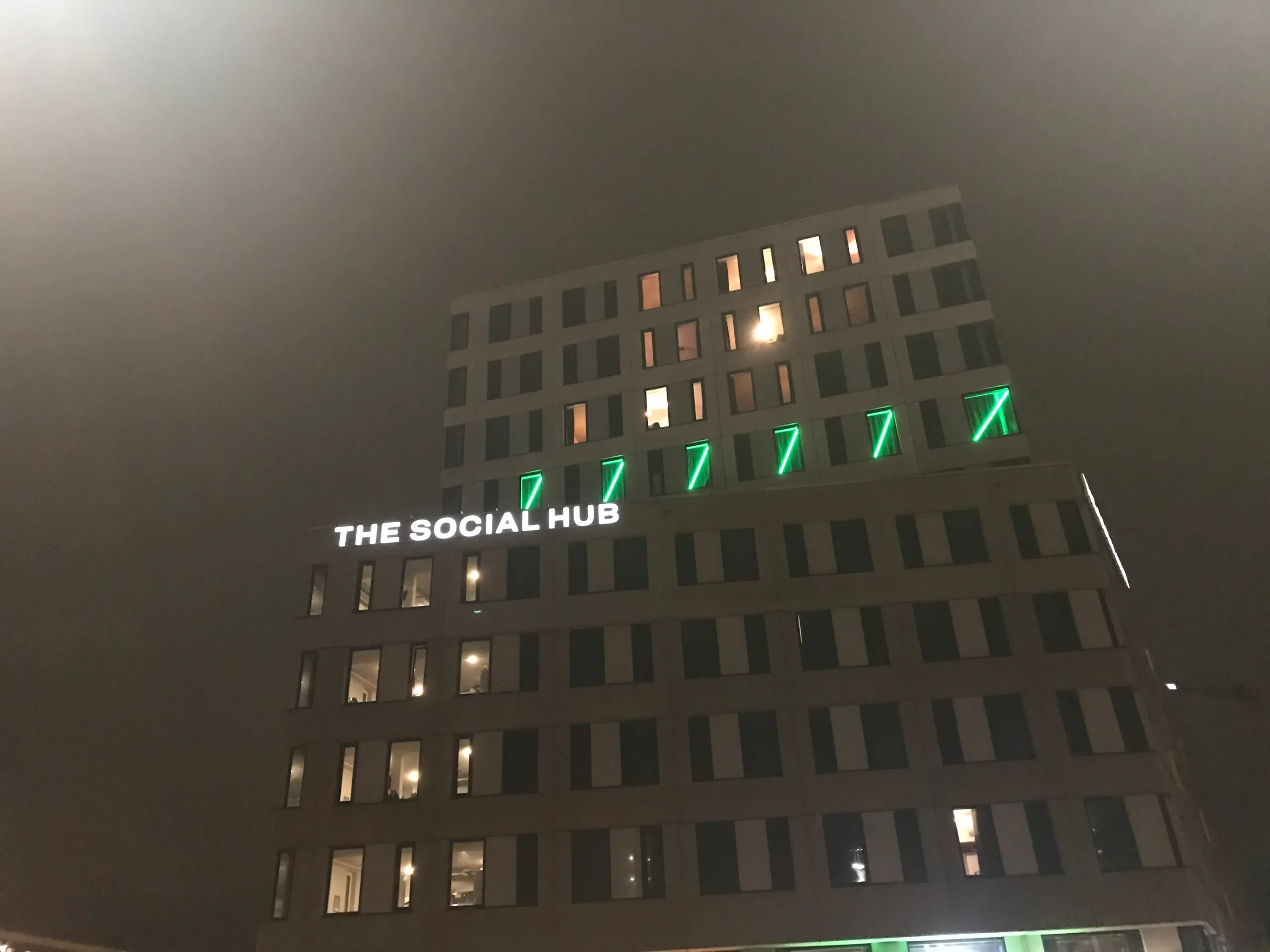
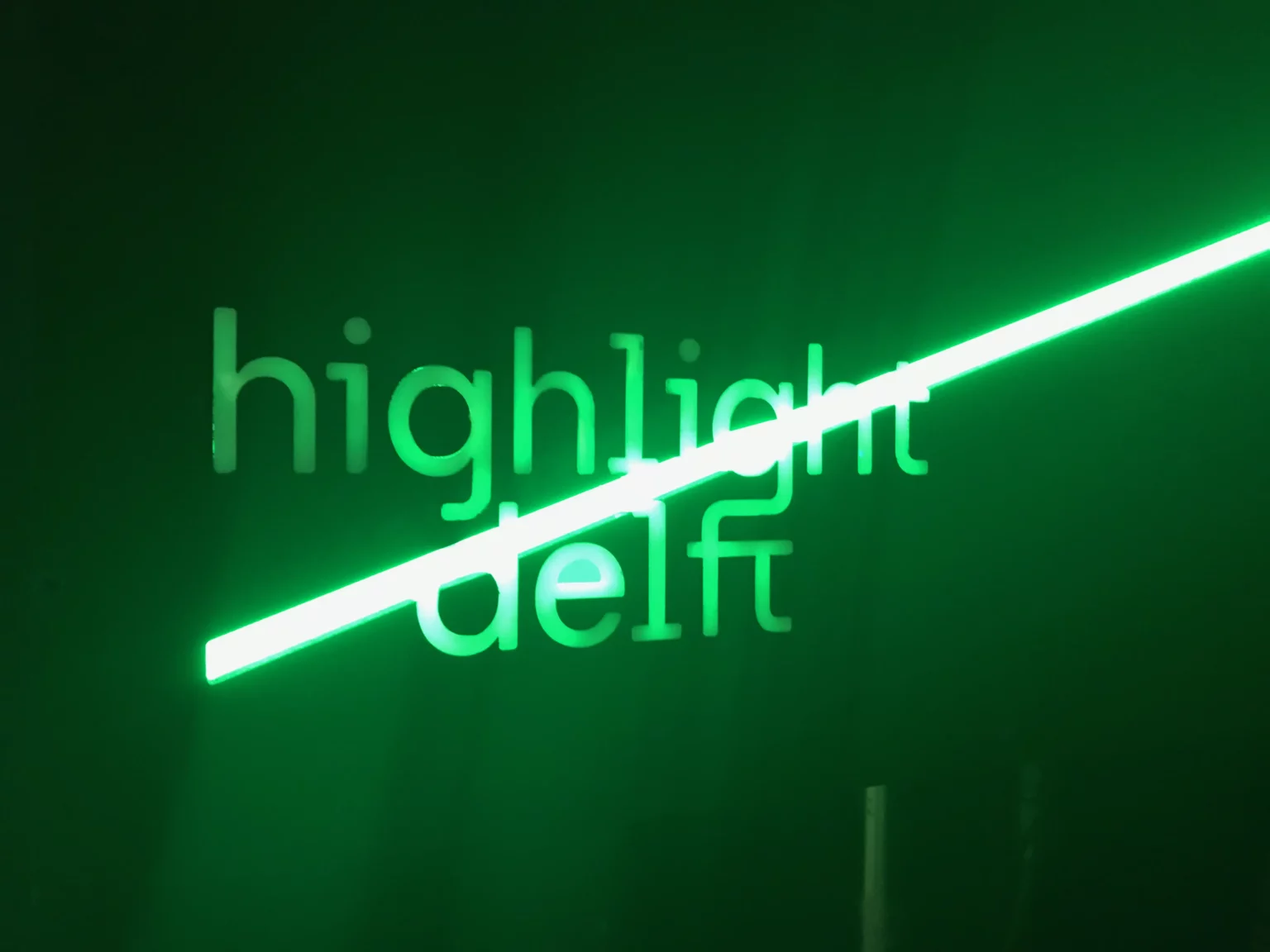
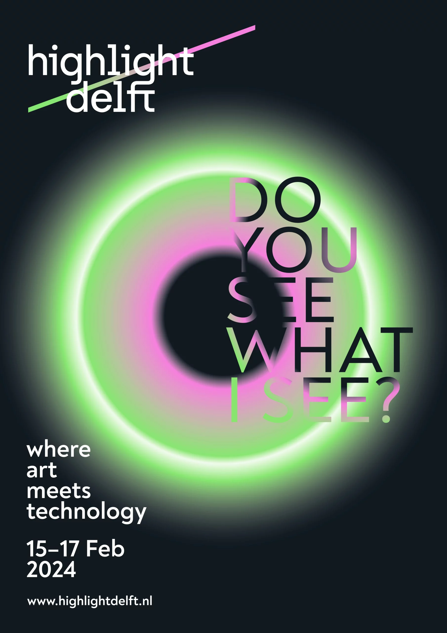
Visual identity for Higlight Delft
Highlight Delft is an innovative festival at the intersection of art and technology. Each year the city of Delft transforms into a living laboratory where immersive installations, light sculptures, and cutting-edge digital works invite visitors to explore the future of creativity. The 2024 edition played with perception and deception.
A bold visual language with a bright colour palette, clean geometric motifs, and dito typography was created for the entire visual identity. The diagonal line in the logo suggests an upward look toward the future, while the visual system extends across posters, signage, and the website, keeping the same sense of clarity and energy throughout
At home in Burgundian Mechelen
The recently renovated Museum Hof van Busleyden asked Atelier Alkema, studio OTW and Cecilia Hendrickx to design its new permanent exhibition. Together we highlighted around fifteen stories from the city’s history. The ring shows how the city around 1500 dealt with its poor, its disadvantaged, and other vulnerable groups. The silhouettes of the medieval buildings still exist and can be found on the city map beneath them.
Edible gardens
Coöperatie Ondergrond manages a network of food forests and edible nature gardens throughout the city of Rotterdam. The edible garden around basisschool De Bavokring required some visual explanation of these alternative food systems, aimed at parents, children, and teachers. A series of boards featuring clear, educational visuals was installed around the garden.
The illustrations were created in a loose‑realistic style that blends fun facts with an inviting, organic aesthetic. This approach makes complex ecological concepts instantly understandable, inviting both children and adults to look and learn a little closer.
Interaction ♥ spatial design
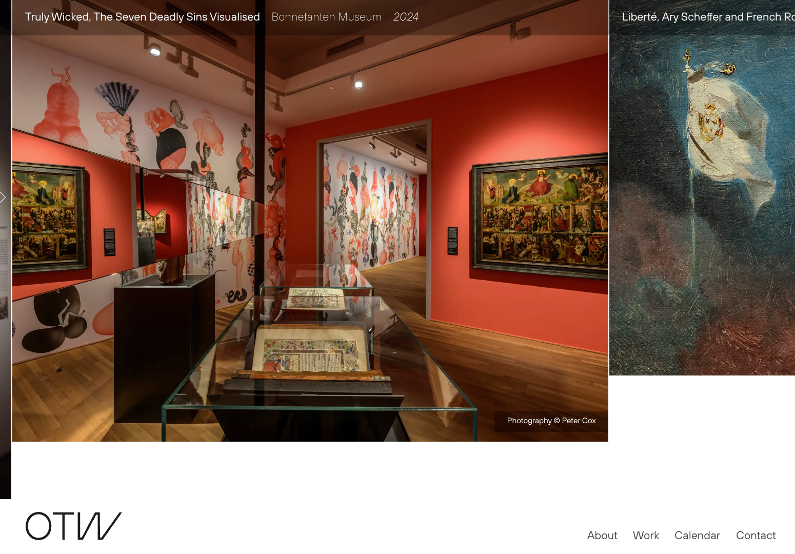
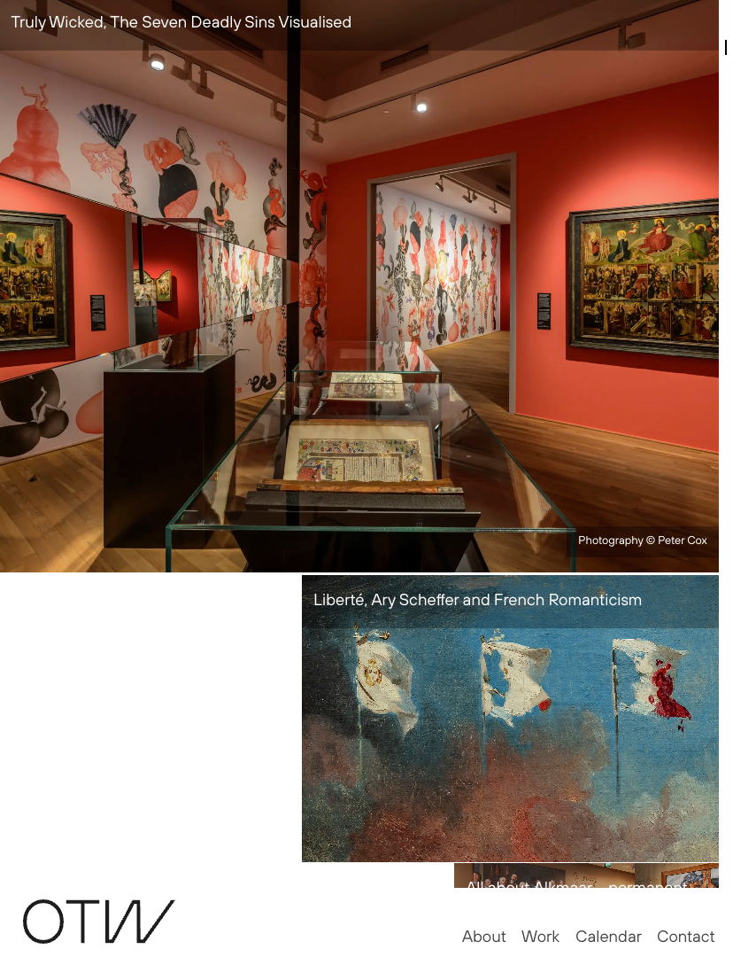
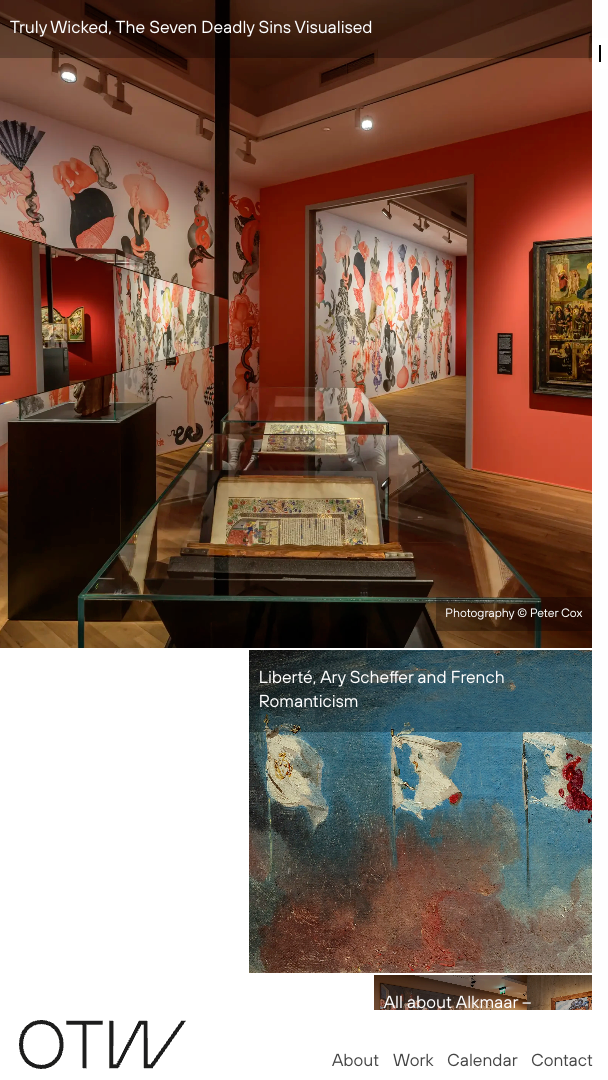
Studio OTW is a design studio specializing in spatial design. They asked me to create a portfolio website that clearly communicates their discipline. I translated this into an interaction design, with a clean, simple logo design and matching typography, and then handled the programming. The site’s navigation embraces the browser’s native scrolling mechanism, using a horizontal axis to guide users. Moving panels within the digital white space present Studio OTW’s work to the viewer.
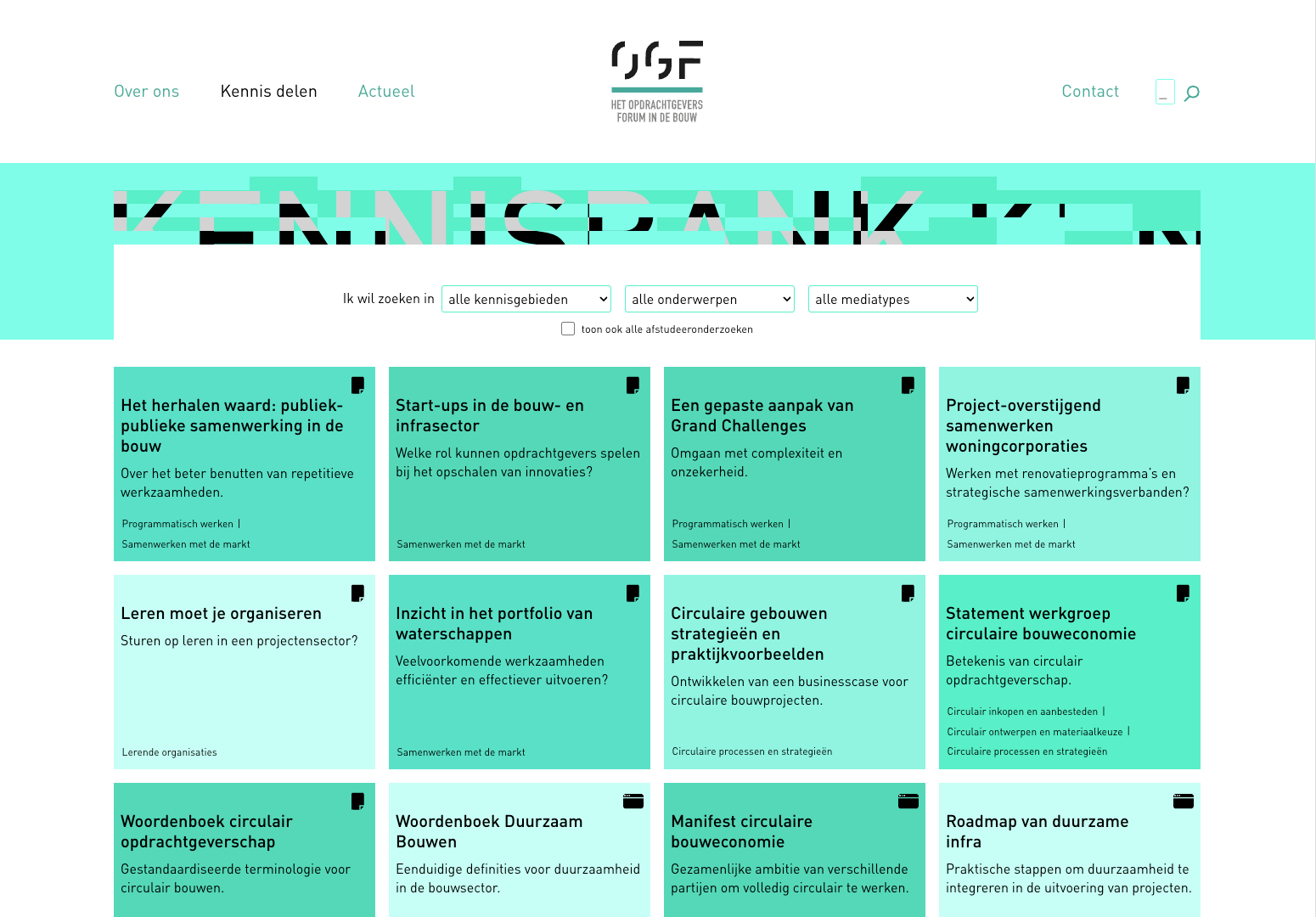
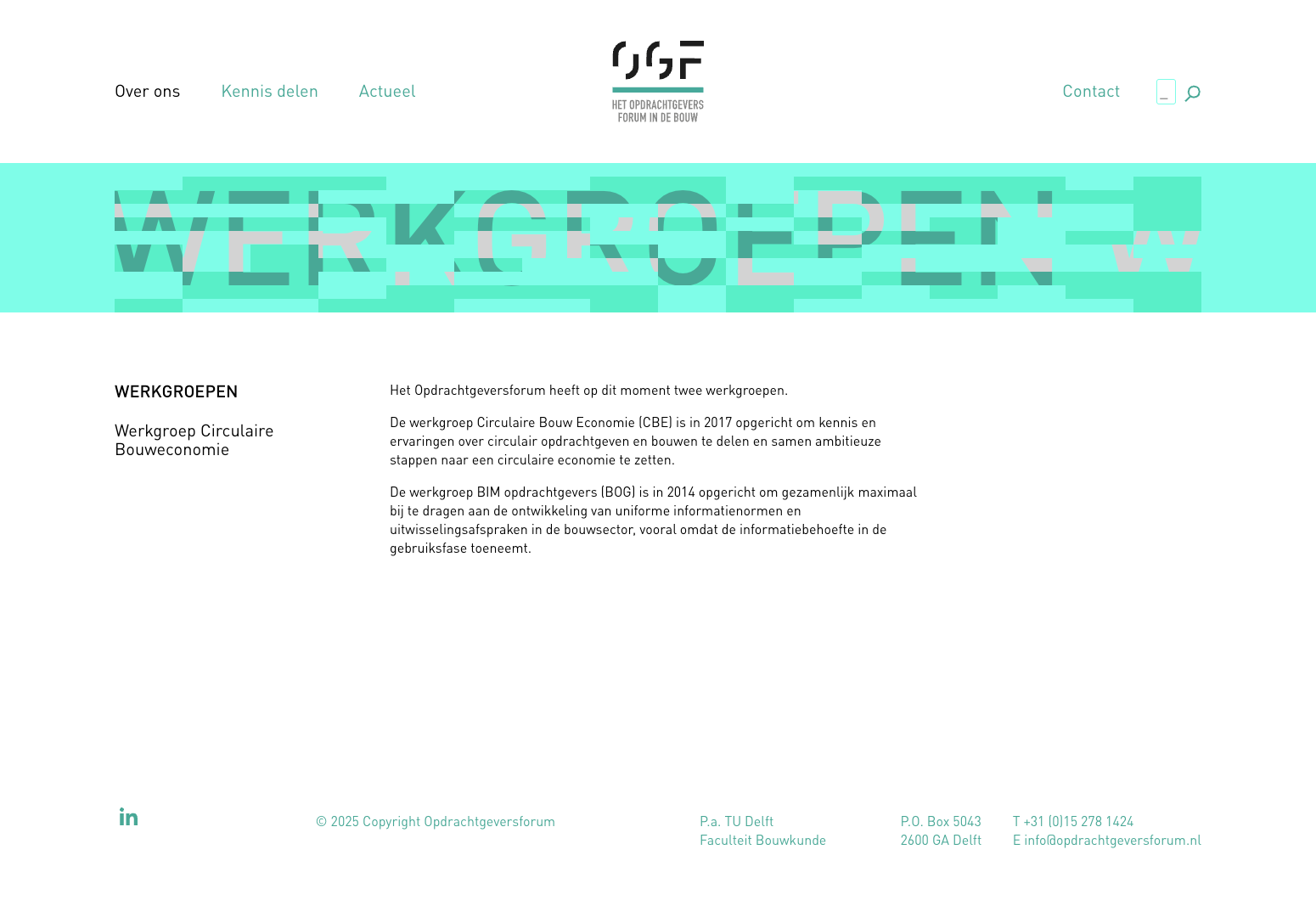
Digital platform design
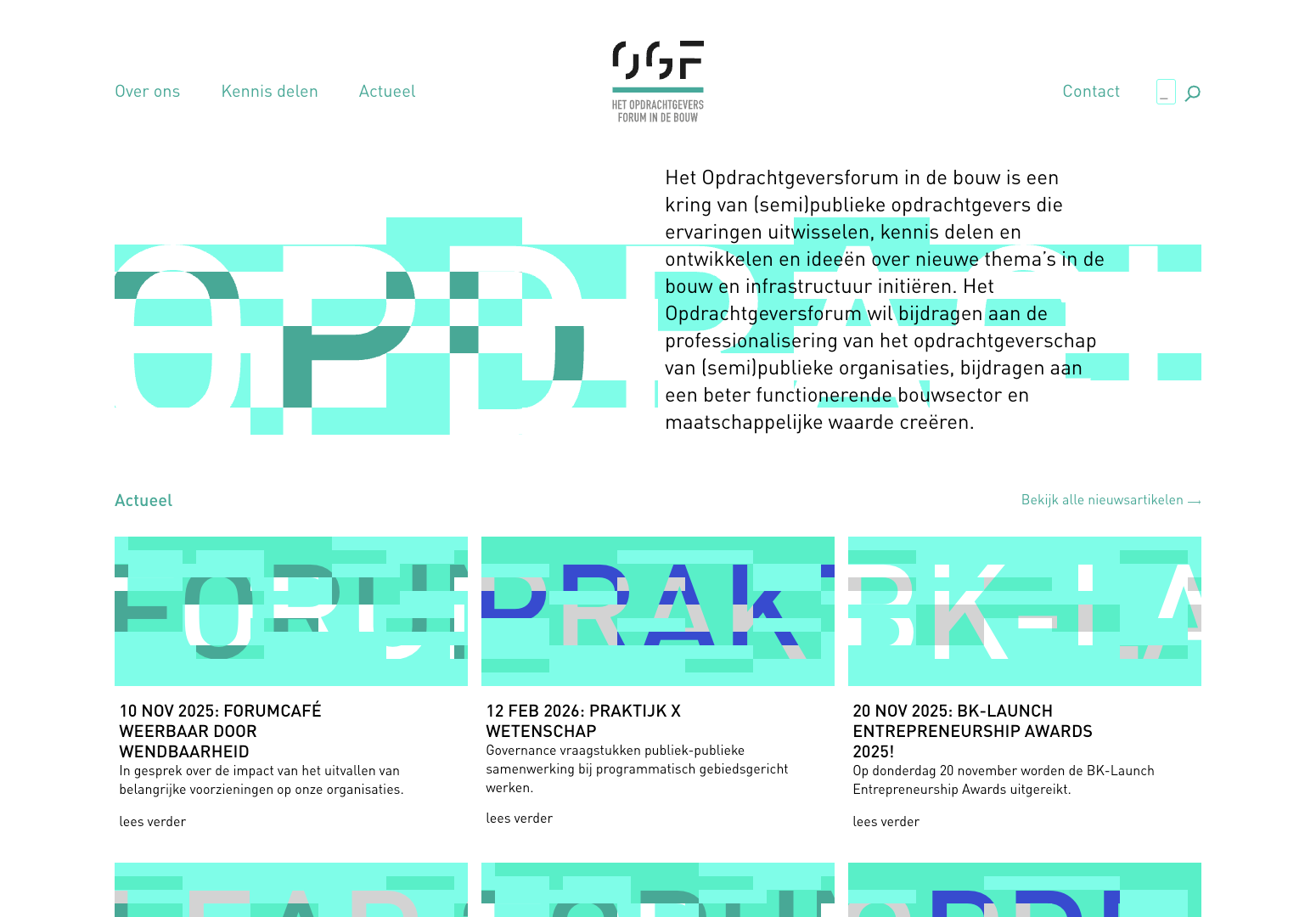
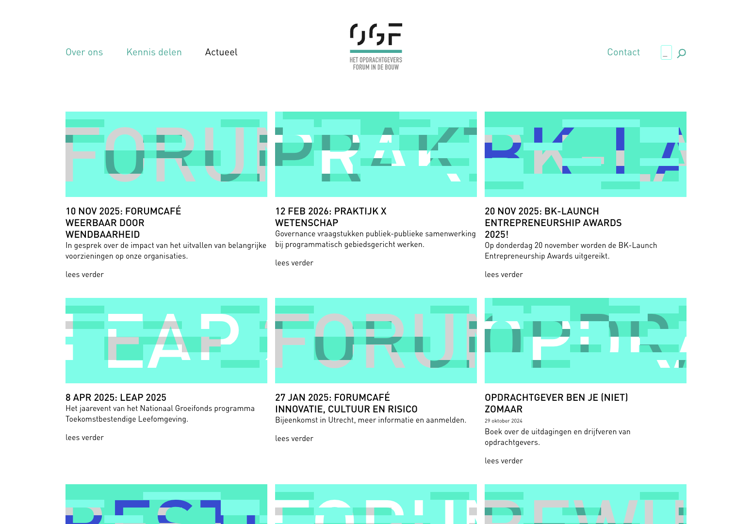
Opdrachtgeversforum in de bouw is a network of (semi)-public clients in the built environment, dedicated to sharing knowledge, driving innovation, and improving the professional client role in construction. They asked me to help enhance their digital presence.
For the website, I designed a content structure that supports the organisation’s expert-led output: articles, reports, events, and knowledge sharing. Since many of their articles lacked photo imagery, I created a solution where each article is accompanied by an automatically generated “building-block” illustration derived from its title. This ensures that no page looks bare, or the same.
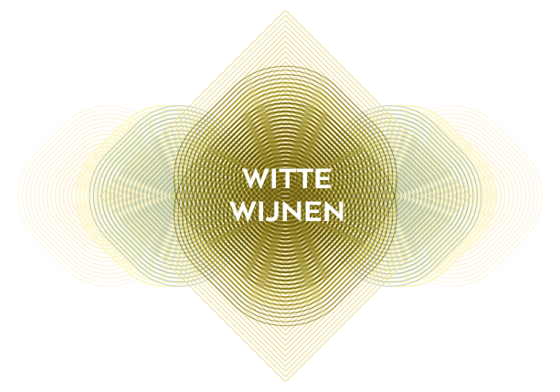
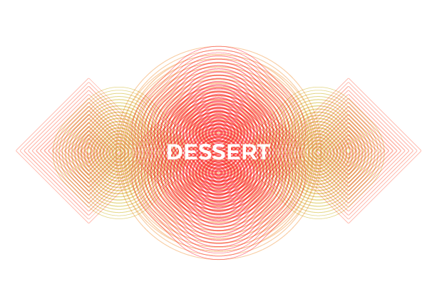
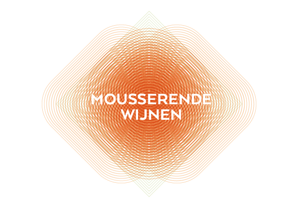
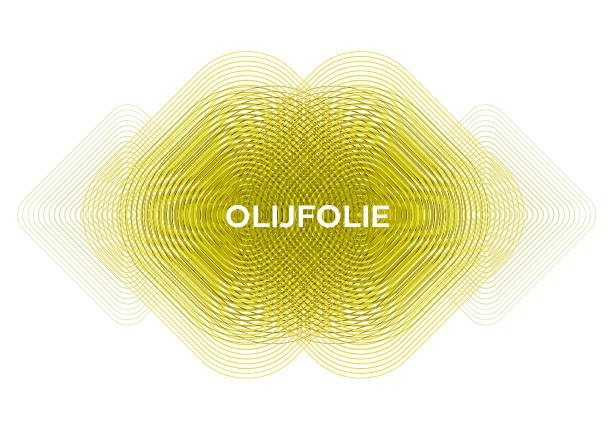
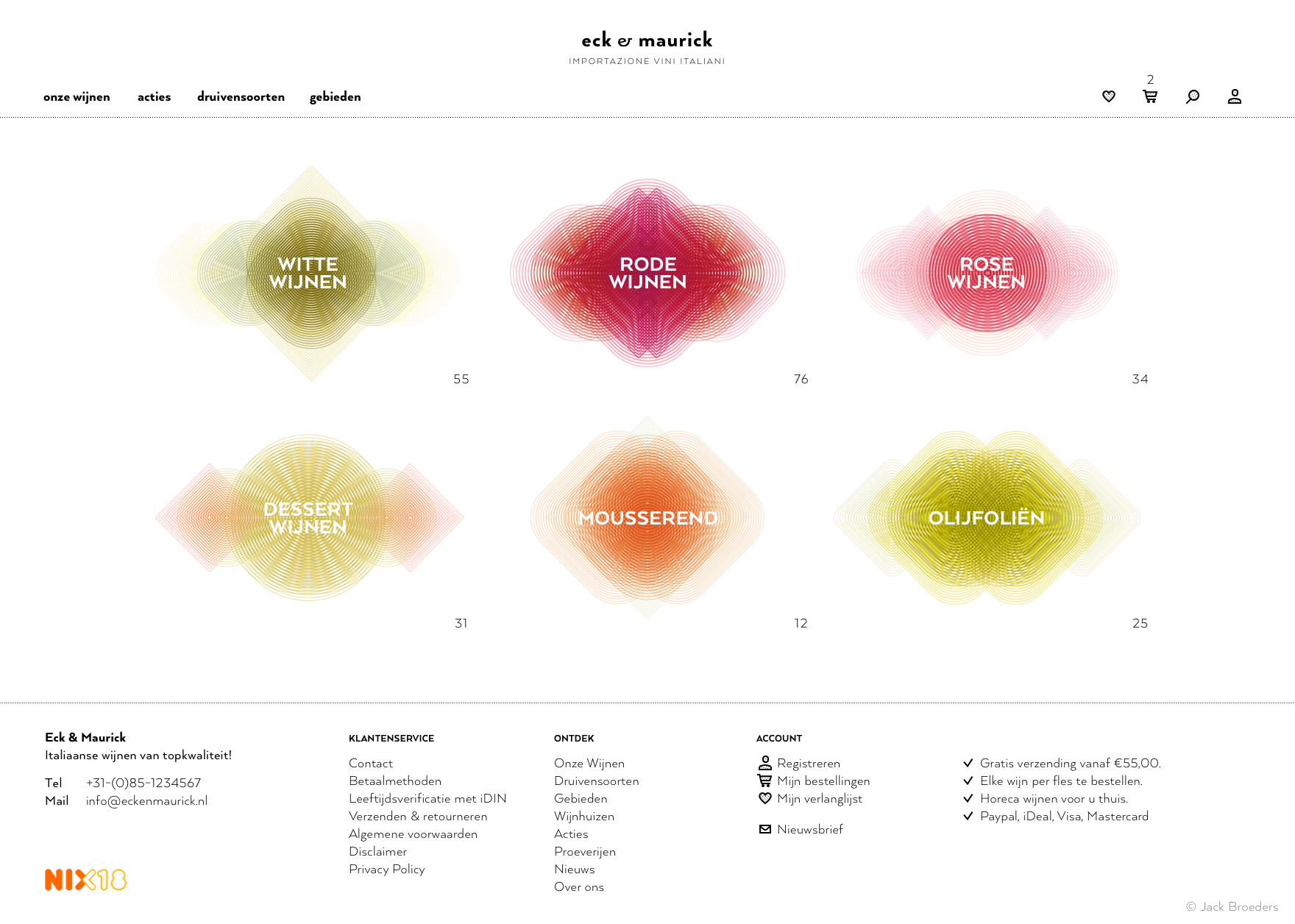
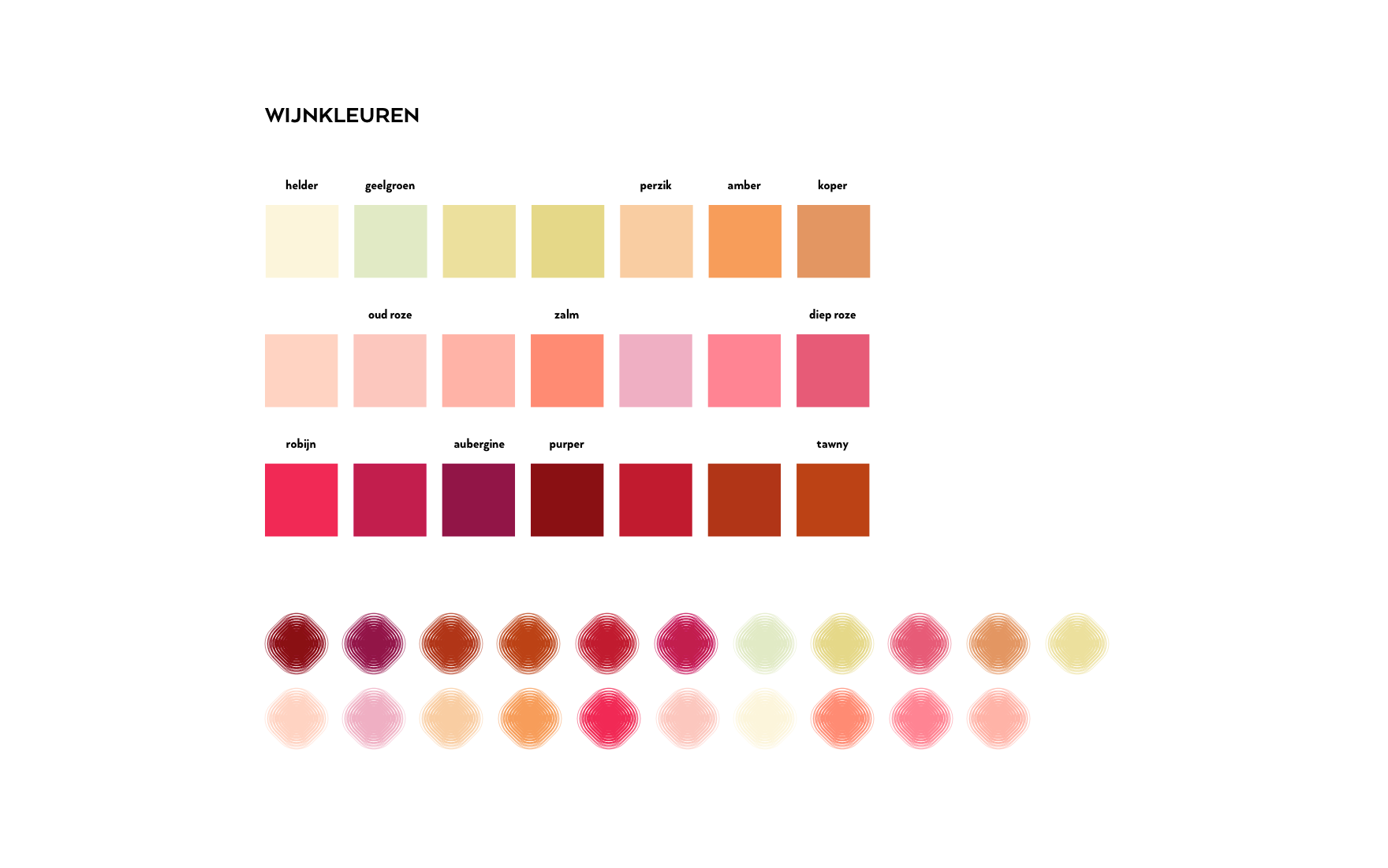
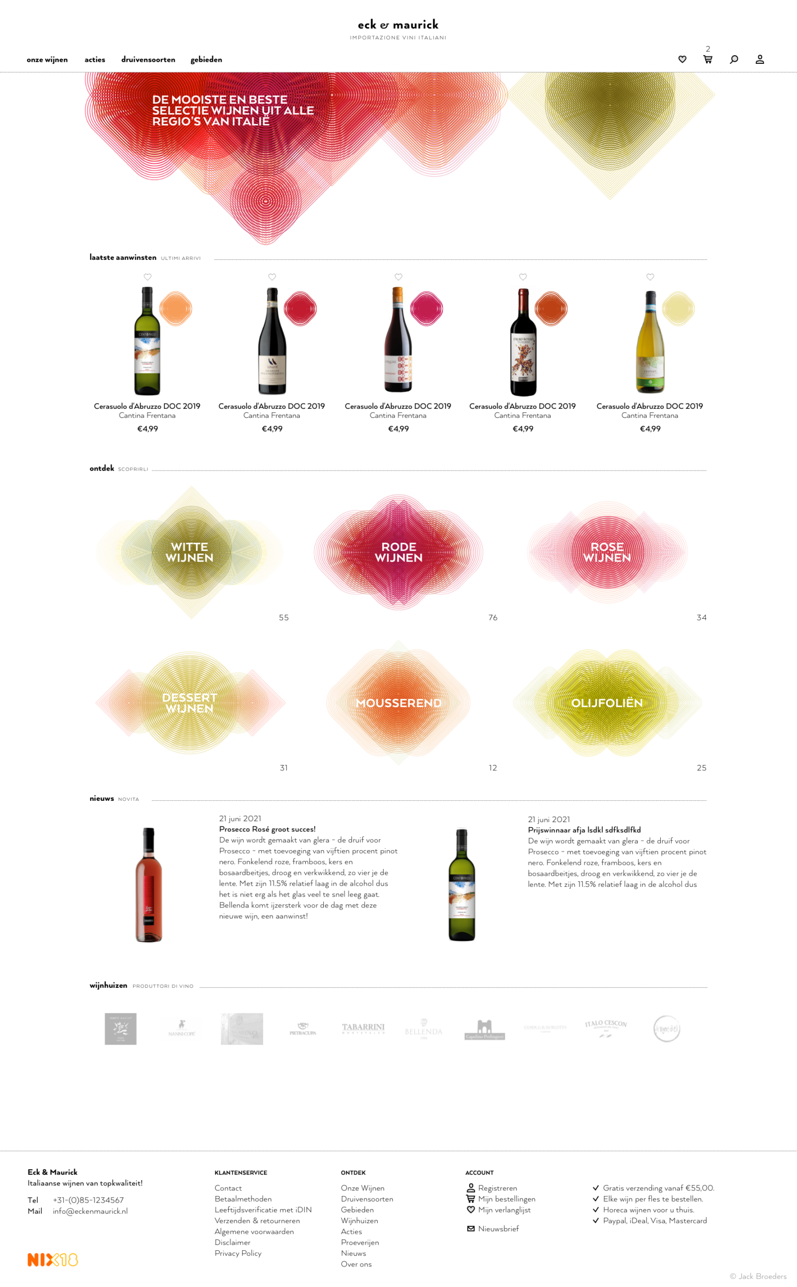
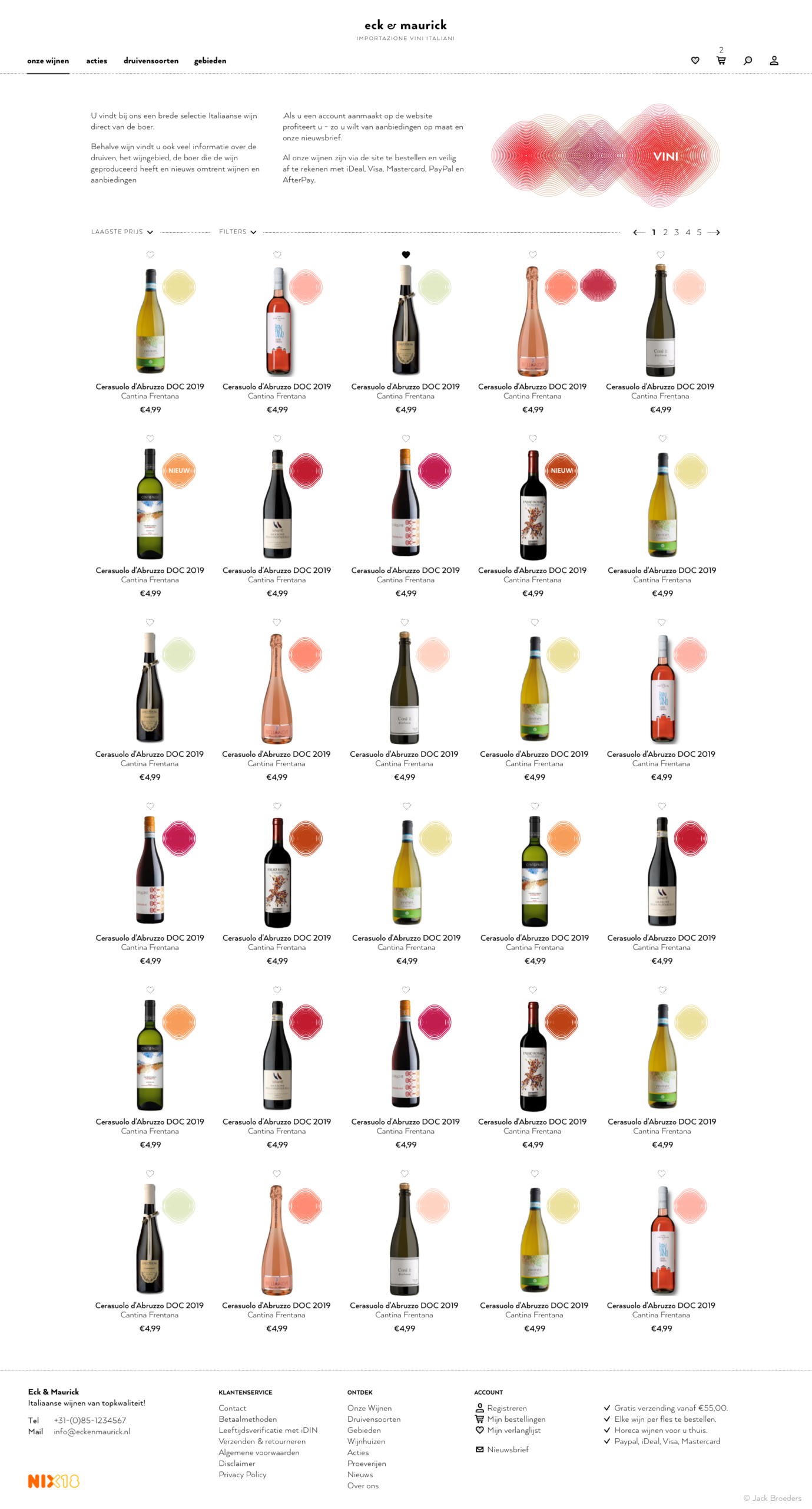
Branding Eck & Maurick
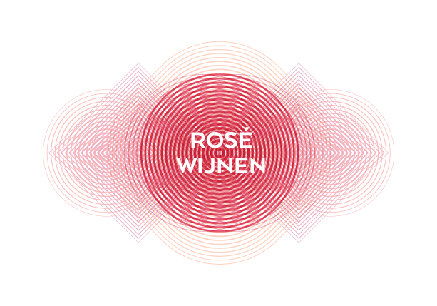
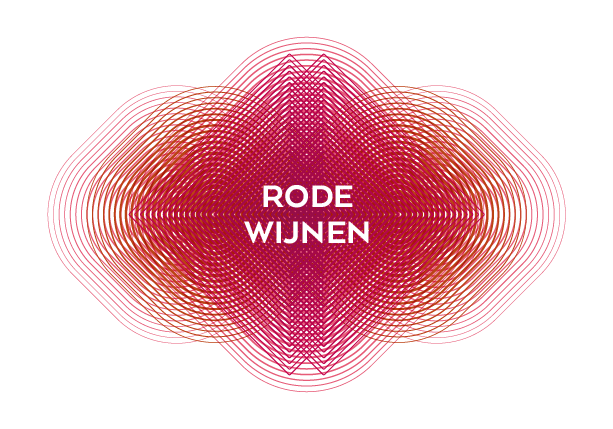
The new branding for Italian wine importer Eck & Maurick is inspired by the influence color has on wine evaluation and the distinctive color nuances that liquids can exhibit. By sliding overlapping patterns, each category receives its own recognizable label with a moiré effect.
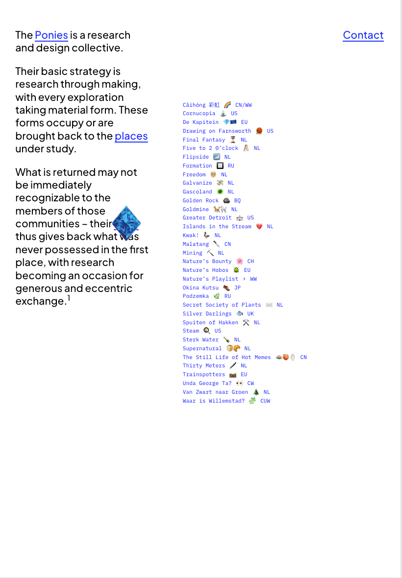
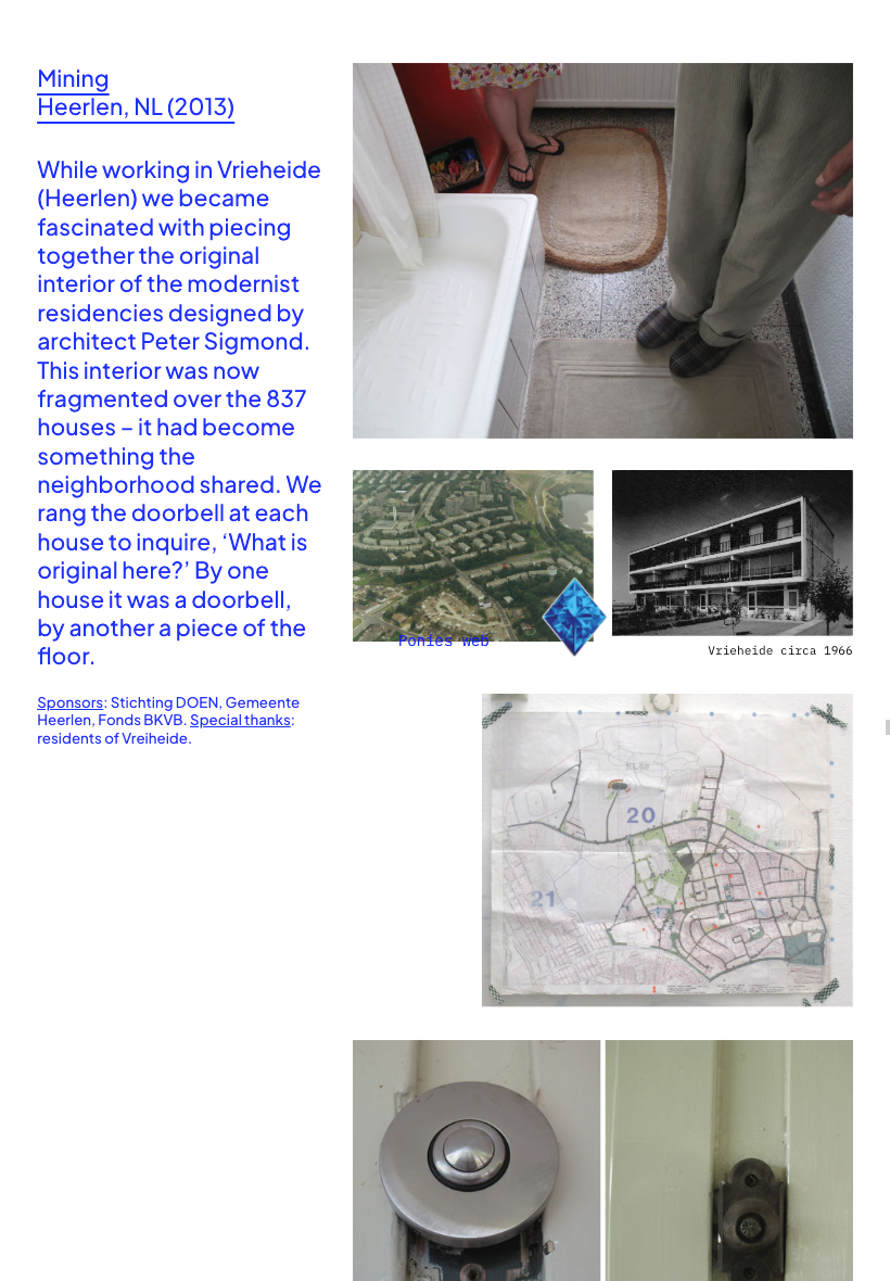
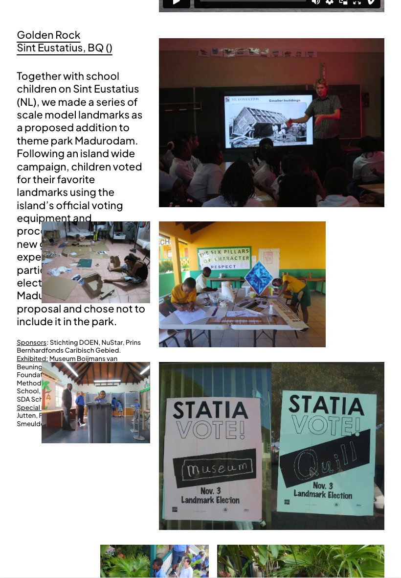
Design collective the Ponies online
The Ponies and I went to Brussels in a quest for their online presence. Fully known as Pink Pony Express, they are a design collective whose process is best described as research through making, and whose work always leads to unexpected outcomes.
We played out the interaction concept and visual design together, after which I built the full site; from layout to responsive behaviour, from the ever-present card symbol that acts as a menu button, to the sticky, flowing project pages. The layout supports their narrative style: each project tells a visual story, almost like a graphic novel, echoing how their collective work unfolds across public space, research, and design.
The animated card symbol, just off the center of the page, forms the heart of the site; a playful compass for exploring their world.
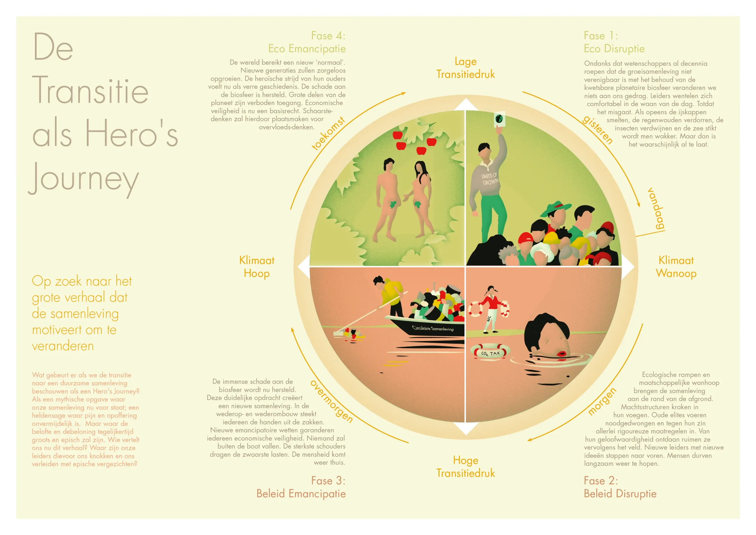
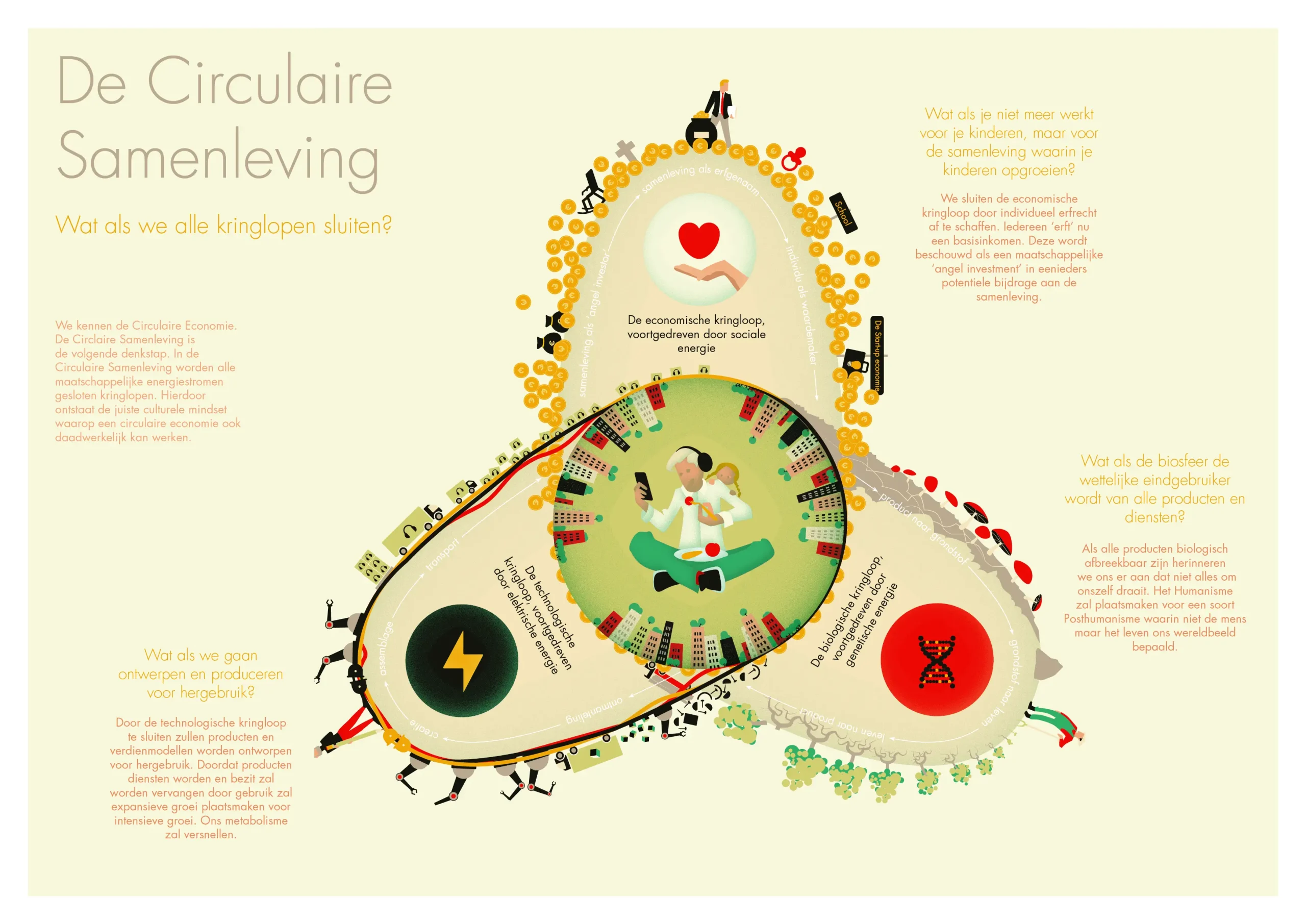
Imagining a circular society
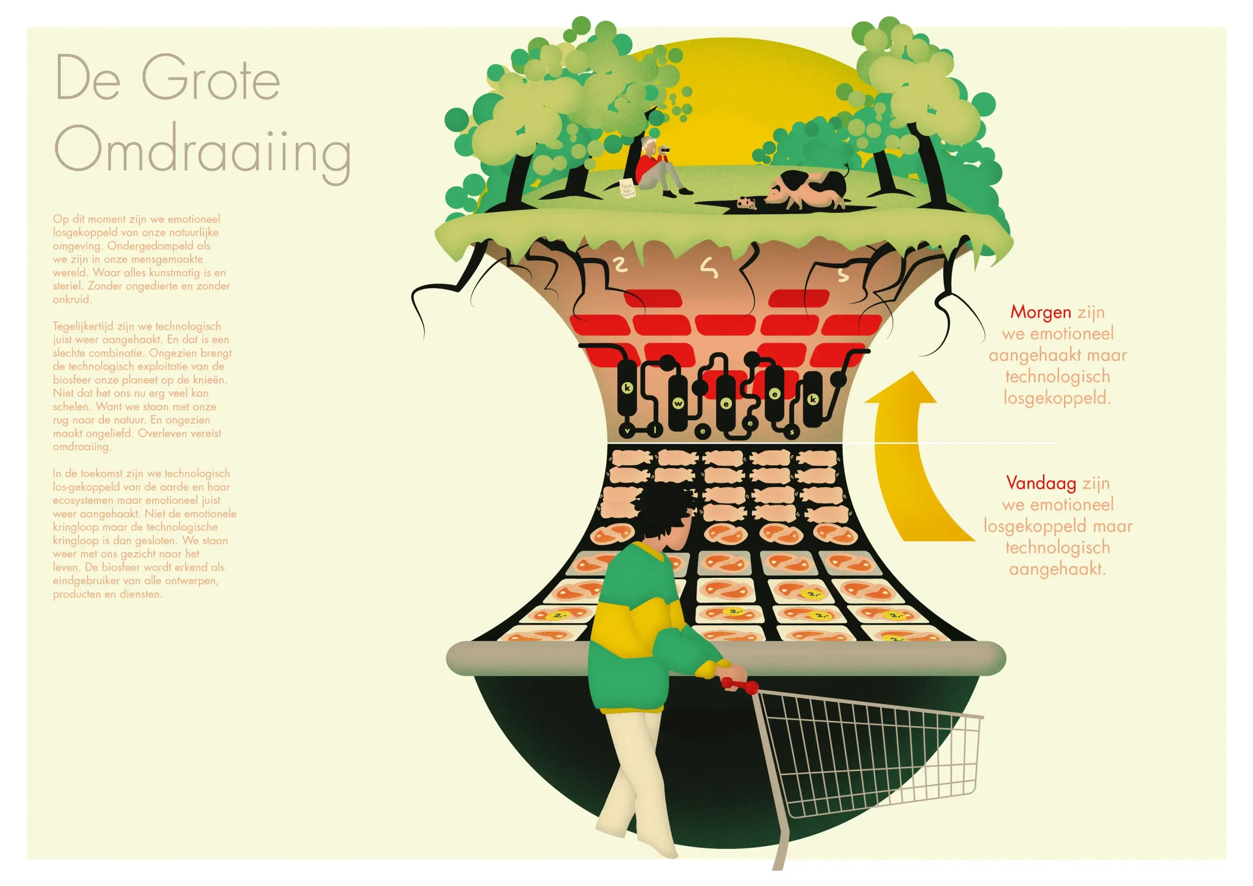
Together with Studio Monnik, we worked on several scenarios outlining how our lives might look in the near future as a result of the climate crisis. Studio Monnik developed the concept of a fully circular society in which economic, technological, and biological loops are all closed. The scenarios were presented to the Municipality of Amsterdam.
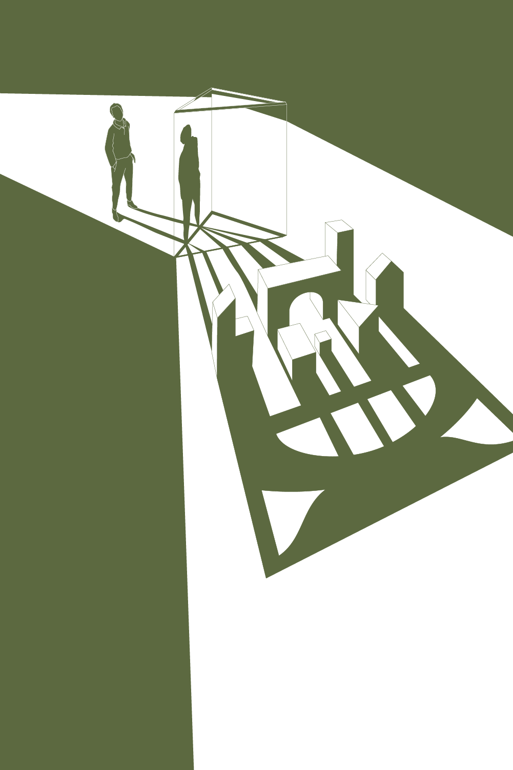
Online presentation Kopvol
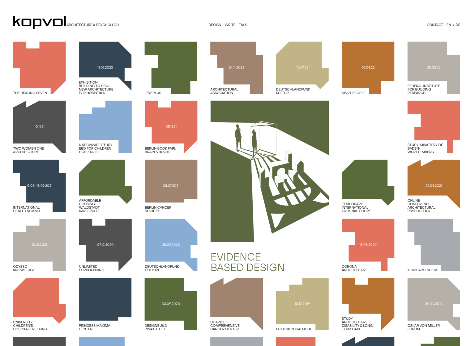
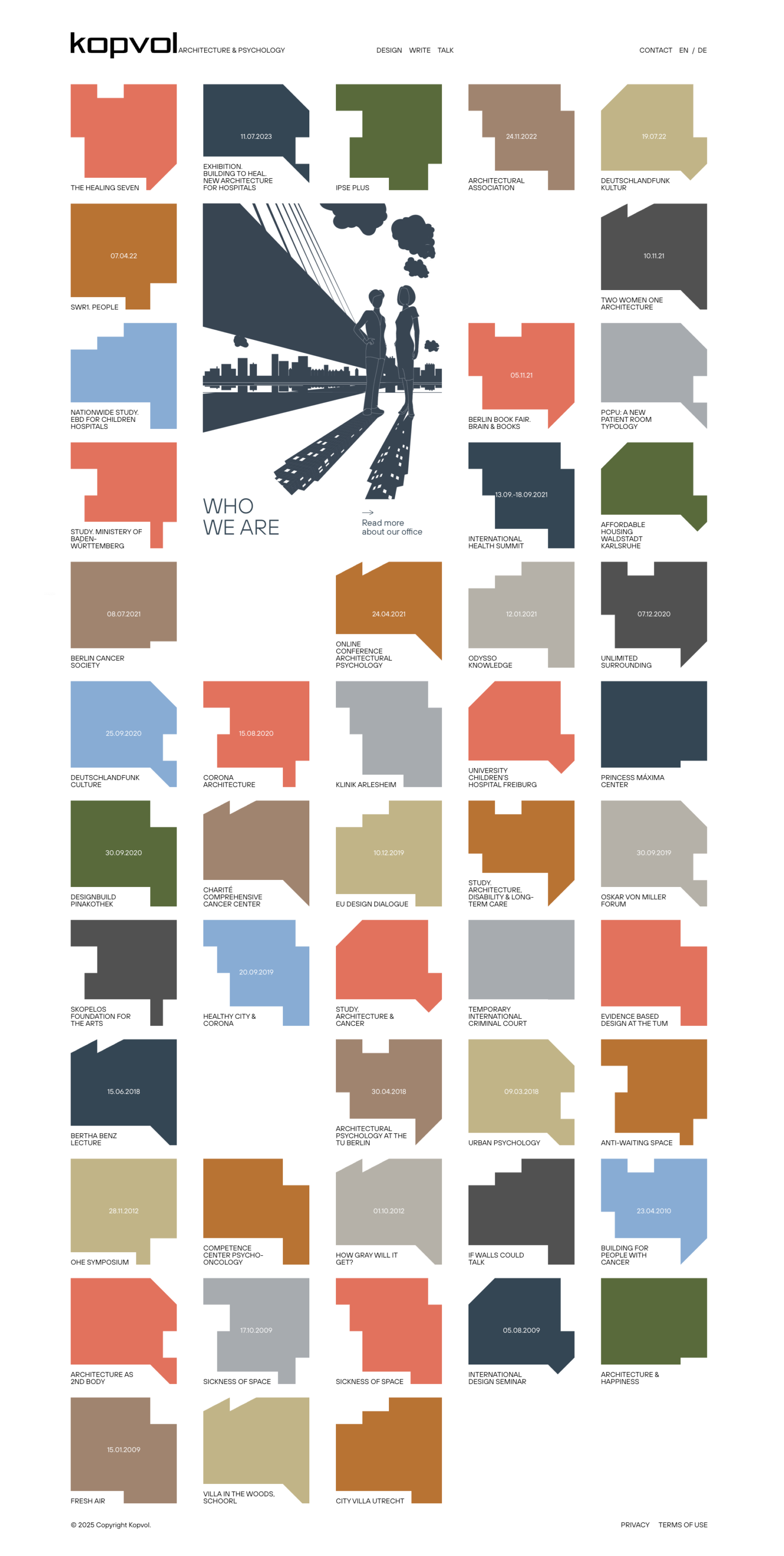
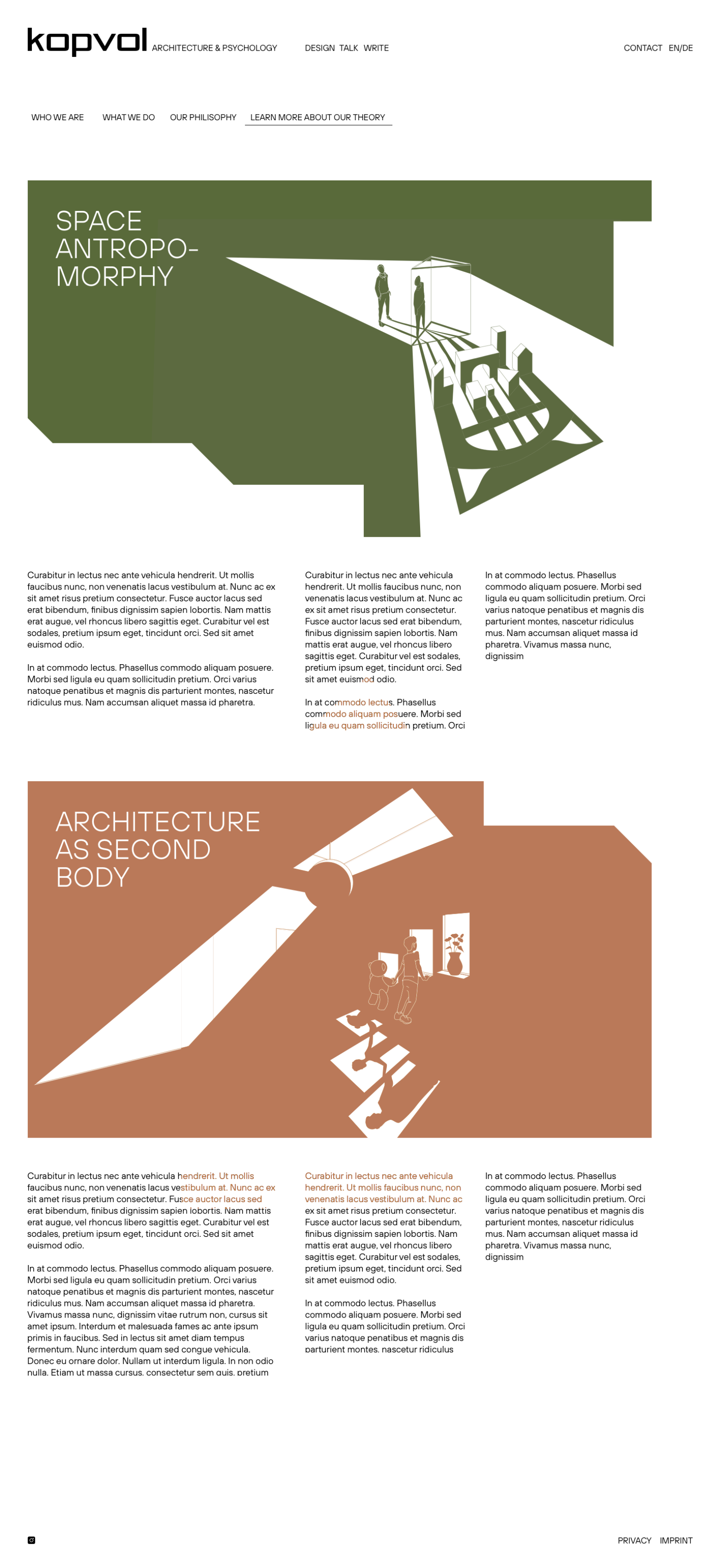
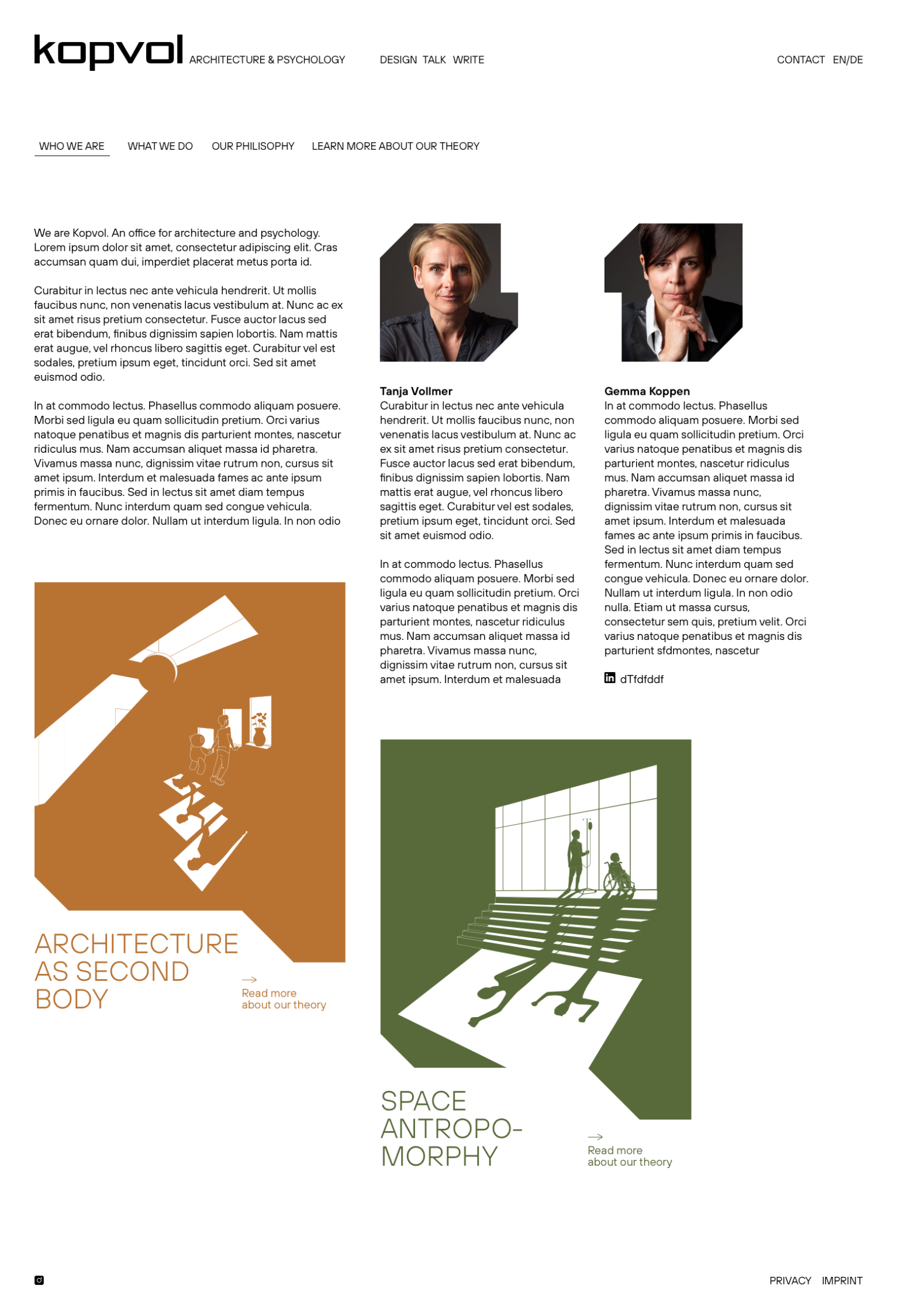
Kopvol is a German-Dutch studio operating at the nexus of architecture and psychology. They asked me to create a website that brings cohesion to their diverse portfolio while clearly communicating what they do.
The design rests on a clean grid, punctuated by computer-generated abstract shapes that differ for each project yet tie everything together, a subtle nod to the Gestalt theory of perception. Accompanying illustrations unpack their philosophy on a different level.


Celebrating 75 Years
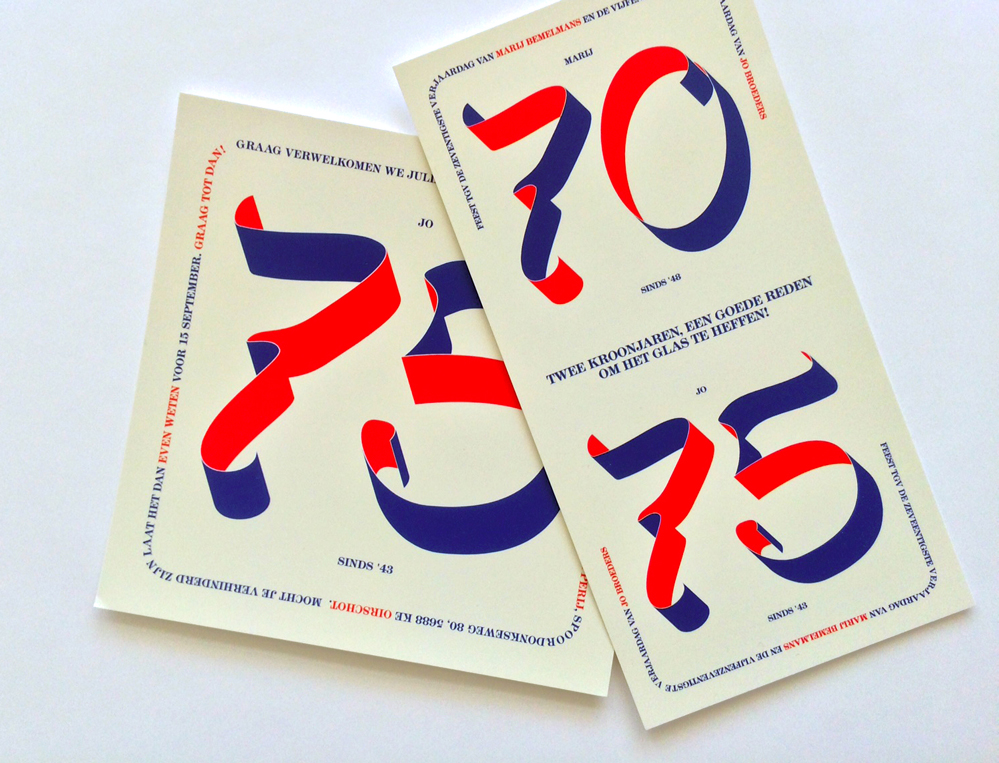
In 2019 I designed the invitation for my dad’s 75th-birthday celebration. Of course it had to have a classic touch, featuring his favourite colors on a warm, celebratory tone. The invitation for his birthday was later combined with his girlfriend’s, resulting in a second set of invitations.
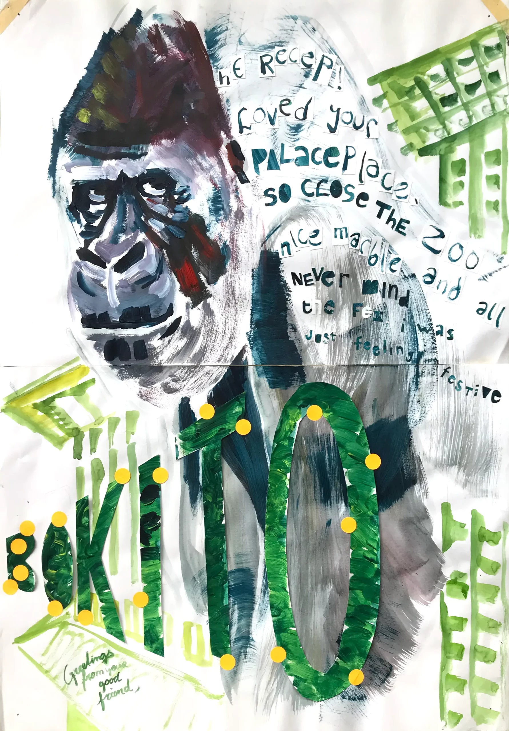
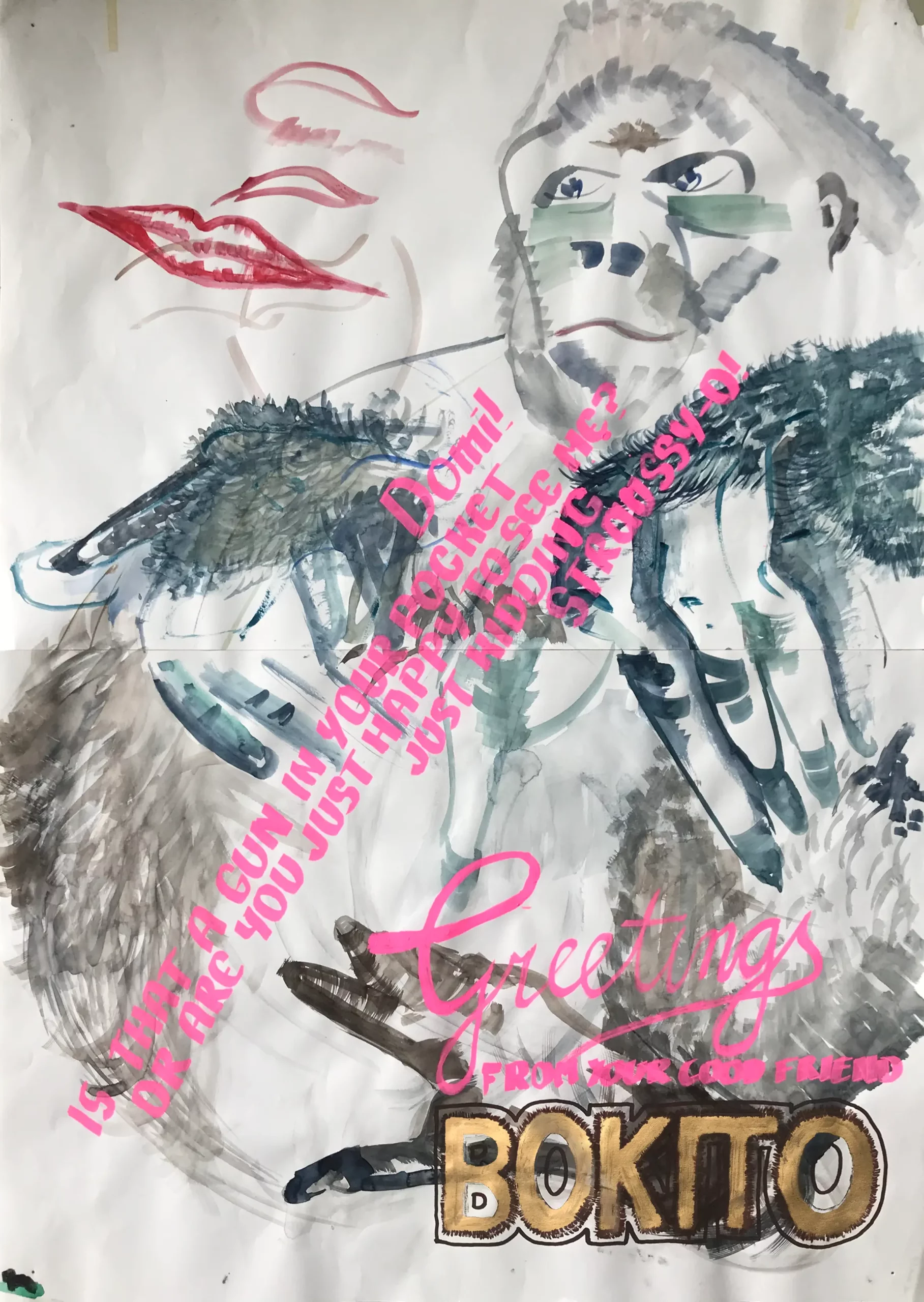
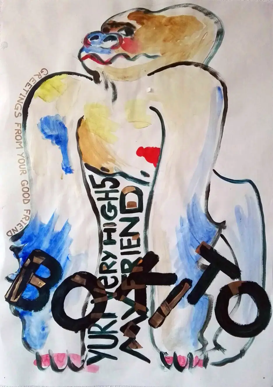
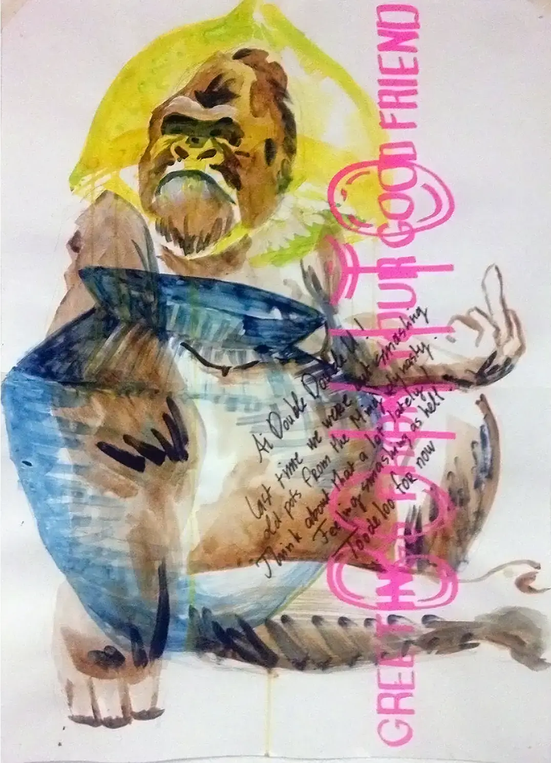
Greetings from your good friend Bokito
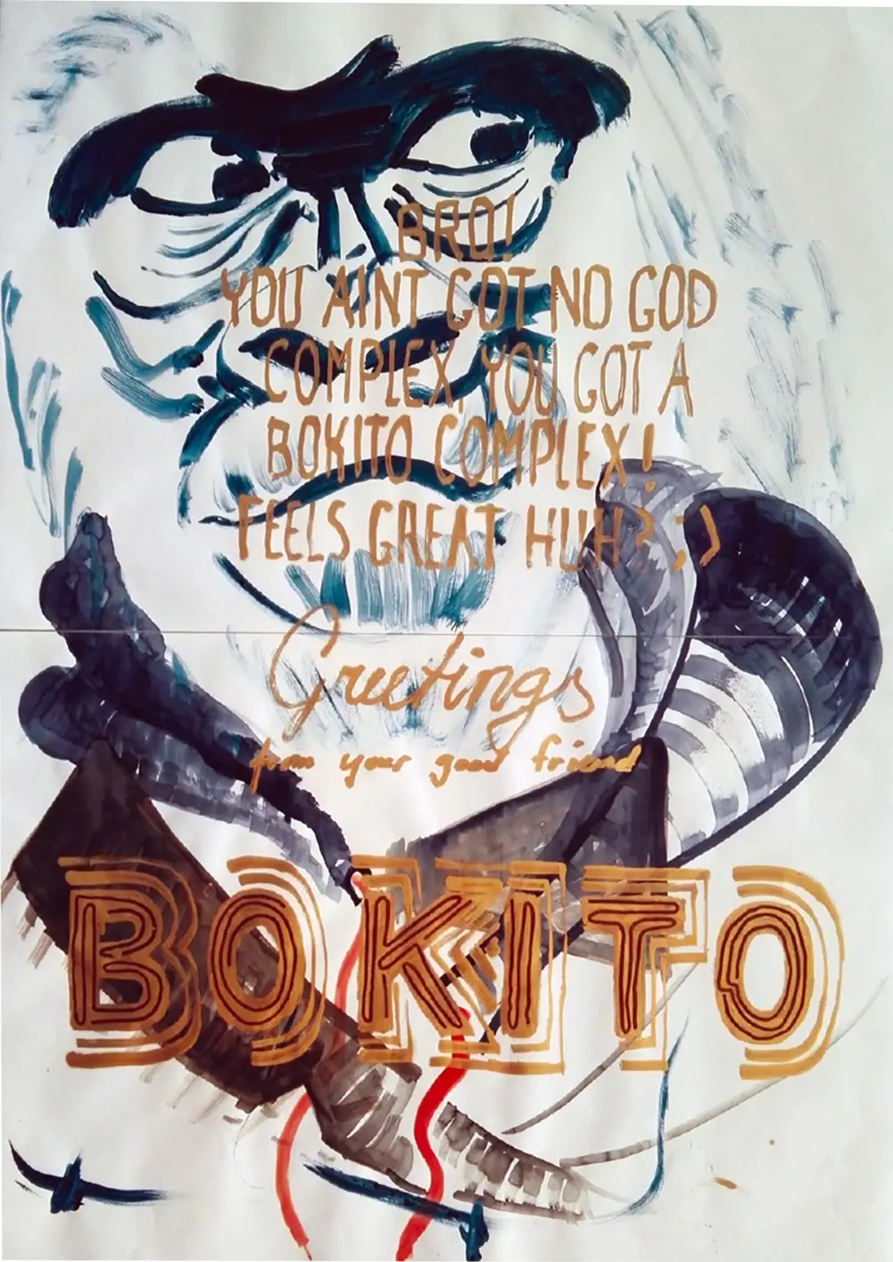
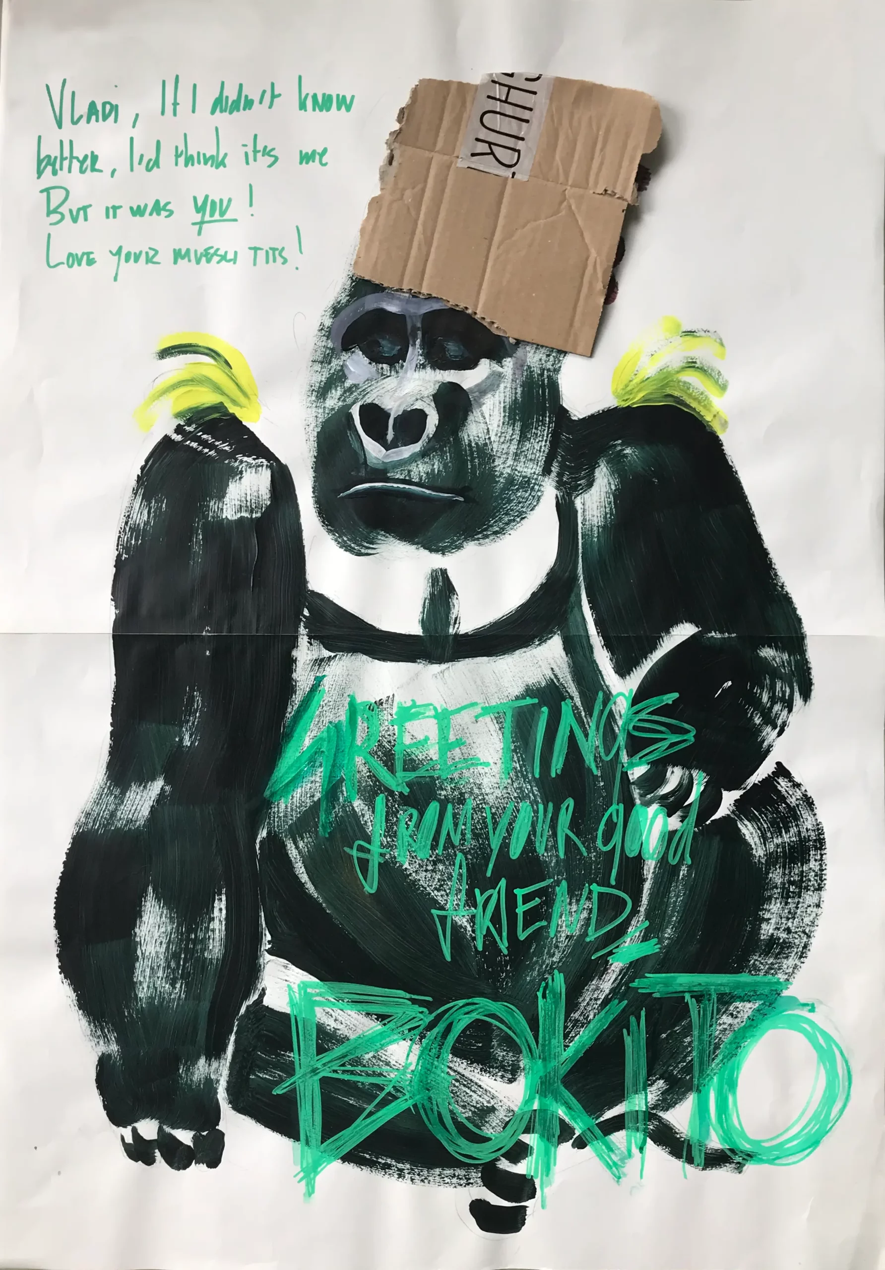
‘Greetings from your good friend Bokito’ is a series of portraits we work on intermittently. Since 2017, we put ourselves in Bokito’s shoes, to write personal messages to his alleged friends. Bokito becomes our alter ego, but he’s not human, he is a silverback gorilla.
Bokito gained notoriety after he broke out of a zoo, in the Netherlands. He became somewhat of a celebrity – even making it into the national dictionary.
More and more people are acting out their inner Bokito these days. In our drawings, we portray the Bokito in public figures, and sometimes in ourselves. Bokito exemplifies the primal aspects of modern human life.
Historically, animals play an important role in politics – from Chinese pandas to the British monkeys of Gibraltar. Bokito is also diplomatic asset. He helps us come to terms with what lies underneath our thin layer of civility.
Bokito sends his greetings exclusively as A2 self-portraits, and postcards. Among his close friends are Kanye West, Joe Pesci, Recep Erdoğan, Dominique Strauss-Kahn, Darth Vader and, obviously, many others.
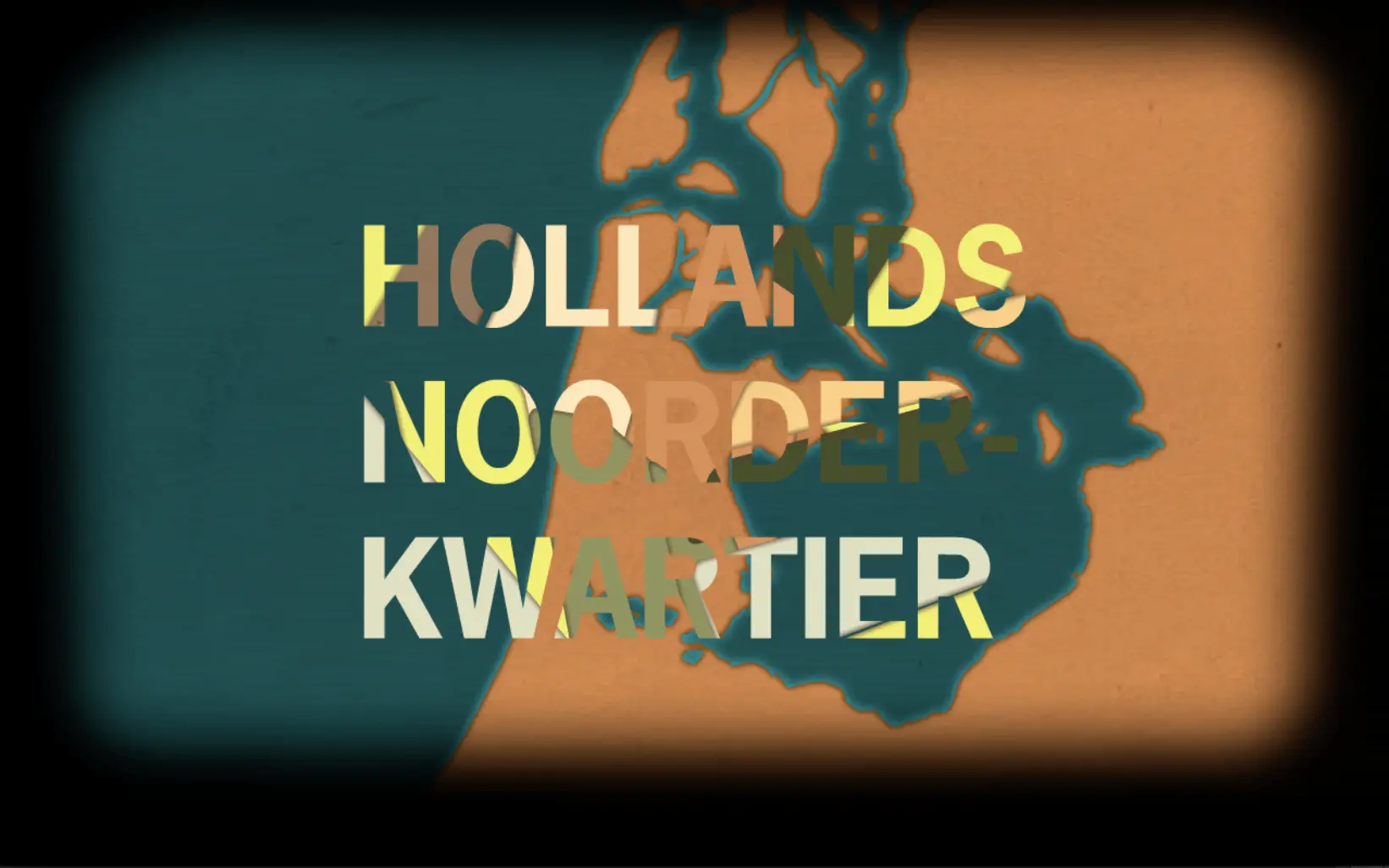
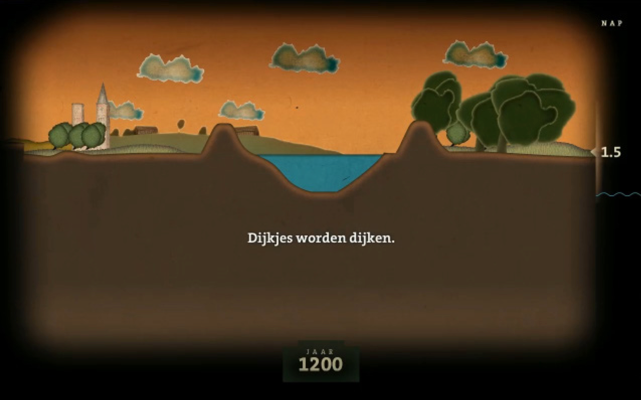
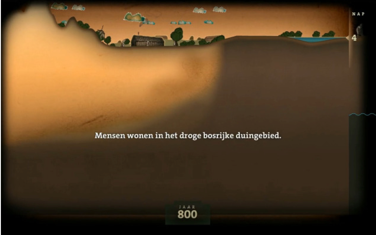
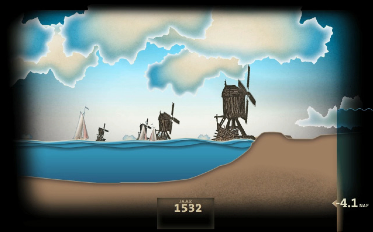
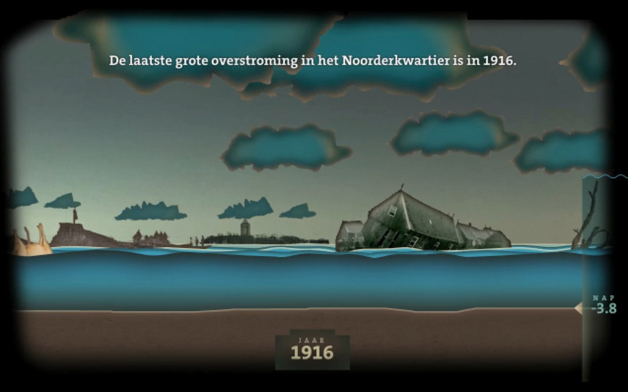
The history of water management animated
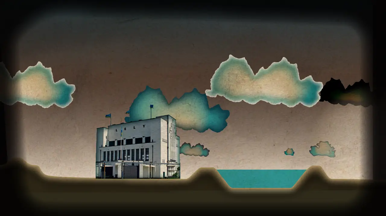
For Hoogheemraadschap Hollands Noorderkwartier, an animation was created that visualizes the history of the Dutch water boards. Together with the client and experts I developed the storyboard, and subsequently produced the illustrations and animations.
The film tells the story of North Hollanders and their ongoing struggle against water; from land reclamation and peat extraction to devastating storms and the draining of countless lakes. A landscape that shifted from 4 metres above sea level to 5 metres below.
With the visual design I wanted to make the threat posed by the restless waters surrounding the sinking land palpable: muddy, heavy, and oppressive, while also referring to the ever-changing maps of the region that have been drawn over time.
Jack Broeders
post@jackbroeders.nl
+31(0)6 52438523
As a visual designer, I blend aesthetic clarity with purposeful functionality. My practice moves fluidly between interaction design and illustration, combining conceptual thinking and a strong sense of form. With a background in Industrial Design Engineering, I’ve come to value design as a process rather than a medium: universal, iterative, and adaptable across disciplines. I work across a wide range of projects, from brand identities and web designs to interactive installations and illustrations.
Worked for the studios Zappwerk, Ontwerpwerk, Studio Dumbar and Total Active Media, both as a full-time employee and on freelance projects.
-
I have collaborated with clients including
- Museum Hof van Busleyden,
- Pink Pony Express,
- Ongelezen Boeken Club,
- Kopvol,
- Studio OTW,
- Eck & Maurick,
- Hoogheemraadschap Hollands Noorderkwartier,
- Universitätsklinikum Freiburg,
- Cecilia Hendrikx,
- Studio Monnik,
- Ministerie van Jeugd en Gezin,
- Highlight Delft,
- Opdrachtgeversforum in de bouw,
- Coöperatie Ondergrond, Museum Boijmans van Beuningen, Ministerie van Buitenlandse Zaken, Ministry of Health, Welfare and Sports, Filmfonds, Stichting Museumjaarkaart, and the Technical University of Delft.